Bad Data is worse than Big Data
“The coolest looking visualisations are often the least useful”. Amen to that. I pretty much agree with the other points in .netmag’s 7 dirty truths relating to visualisations, another of which is also summed up in a tweet:
Bad data is a way bigger problem than big data
— Richard Minerich (@rickasaurus) March 4, 2013
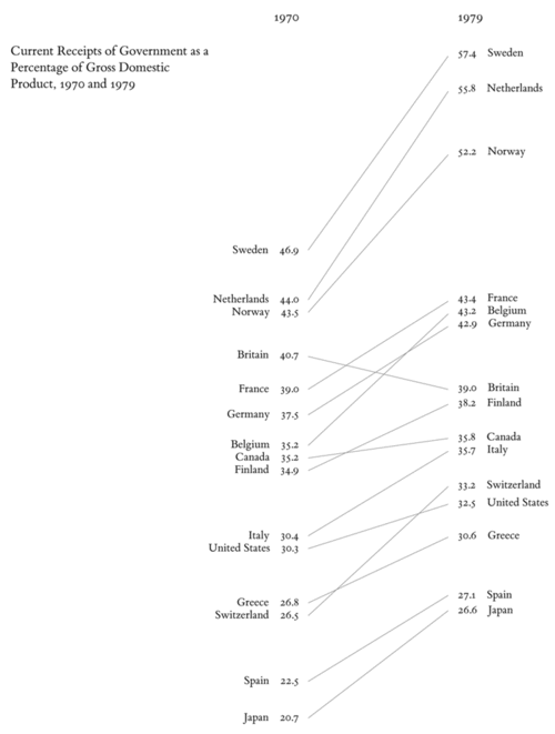
The sad triumph of style over readability reminds me how I’m still surprised at the number of designers who have no idea who Edward Tufte is. If you’re one of them (and as I’ve noted above, if that’s the case you are more definitely not alone), he is perhaps the leading person to look to in regards to making visualisations or infographics . He coined the phrase ‘data junk’ and is to visualisation what William “omit needless words!” Strunk Jnr is to writing (Apparently he’s “affectionately known as the da Vinci of data“!). His books are a delight of minimalist but highly readable graphs. (If you have to choose one book, go with Envisioning Information, and if you need another, his most recent Beautiful Evidence).

That said, it has been pointed out that sometimes some gratuitous imagery can serve a point, and for that matter, that his workshops aren’t quite as good as his books.
Speaking of hiding the sources, I do take some issues with the design of this UX Statistics diagram (particularly that the sources are hidden at a long scroll) but at the least it’s an interesting example of using CSS and JQuery.
If you need to look to a discipline for examples of non-data-junk visualisations, I’d say the place to go was science. Following on from my recap of Rowan’s use of NumPy to visualise proton refraction, here’s a series of images of beautiful science visualisations. Speaking of which, apparently key languages for data scientists are R, JS, and Python
Key languages for data scientists: R, JS, and Python. #NICAR13
— NU Knight Lab (@knightlab) March 1, 2013
Member discussion