Looking backward to look forward
I love maps. I love making maps. And I love that people make many different types of maps. Journey maps, relationship maps. Affinity maps.
However, one I don’t see many of are timelines. I’m not sure why. It could be because they involve a lot of desk research to do. Or because people are more interested in the present than history. However, I find timelines a useful tool for most projects.
Here’s why:
Timelines help us understand how something came to be
The word ‘provenance’ can sound like jargon, but I like using it in the context of understanding why something came to be:
prov·e·nance (prŏv′ə-nəns, -näns′)n.
1. Place of origin; derivation.
2. a. The history of the ownership of an object, especially when documented or authenticated. Used of artworks, antiques, and books.
b. The records or documents authenticating such an object or the history of its ownership.
The Free Dictionary
For me, provenance can solve mysteries of things having awkward seams. Often buildings with awkward stairwells or lifts that don’t serve all floors have a history of being multiple buildings. Or, in the case of someone I know working on a UK bank’s database only to find sections in French, the mystery was solved when he learned that the database had started with a French acquisition and was now the only remaining trace of that company.
I decided to use this approach to investigating a common complaint, that IT systems within a government agency—in this case, the Department for Work and Pensions—don’t talk to each other. Combining the idea of provenance with Conway’s Law — that an organisation’s IT will copy its communication structure — I decided to do some mapping of the department.
I used National Archives data (literally through the provenance of documents as they were moved with the changing departments, snap!) to map out the history of the department back to what I considered a reasonably start for information technology systems, 1980. (I later found out from the Ivan Fallon’s book The Paper Chase that this diagram could go much further back, but I will save that for another map).
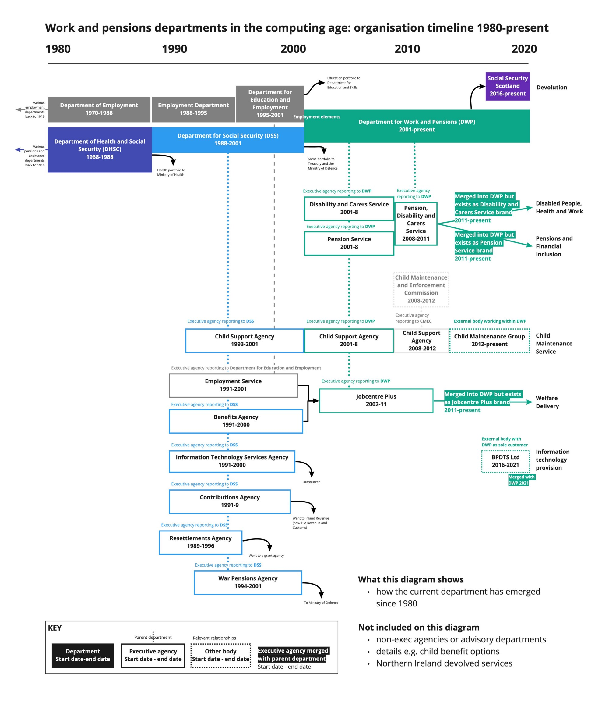
History of the department from 1980–2020. Based on desk research so there may be some errors.
Some key elements I took from this diagram included:
- systems made in the 1990s had no real reason to talk to other systems as there were several executive agencies!
- some agencies had merged and split—which could mean better (more recent) documentation, or more fragmented systems
- services that had switched owners (for example Child Benefit) could have different systems again.
Is this unusual? Probably not. James Wilsons point out in his book On Bureaucracy, that most established ‘bureaus’ (government agencies) turn into snowballs that absorb smaller agencies. And reshuffles aren’t unheard of. Looking at the list of UK government departments with “and” in their title makes me think that this experiment could be repeated with several other departments.
Timelines contextualise a thing in the era—and implicit values—in which it was created
What is £3,000 worth to you? Back in 1986 it was 4 months salary for a teacher, ¾ of a SEAT Ibiza… and also the threshold for a particular policy’s tax rules. 30 years later, I was working on a digital service for said policy, and the £3,000 was there, unchanged. (For those interested, adjusting for inflation alone would have made it £8000 in 2016). This meant that far more people were getting caught with this figure than perhaps originally intended. This example stuck with me as one reason to investigate when policies are enacted.
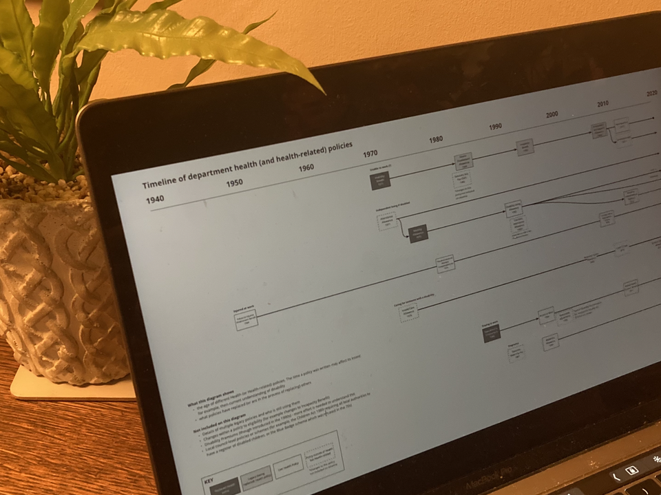
More recently, Ali and I used this as a prompt to do a timeline of health related policies. There is a lot of interest in government in ways to see if we can make it easier for people to get what they’re entitled to without having to do multiple applications and repeating themselves.
While we did other timelines relating to life events, we did this map with the idea that the age of various policies might affect how easy it was to combine questions together.
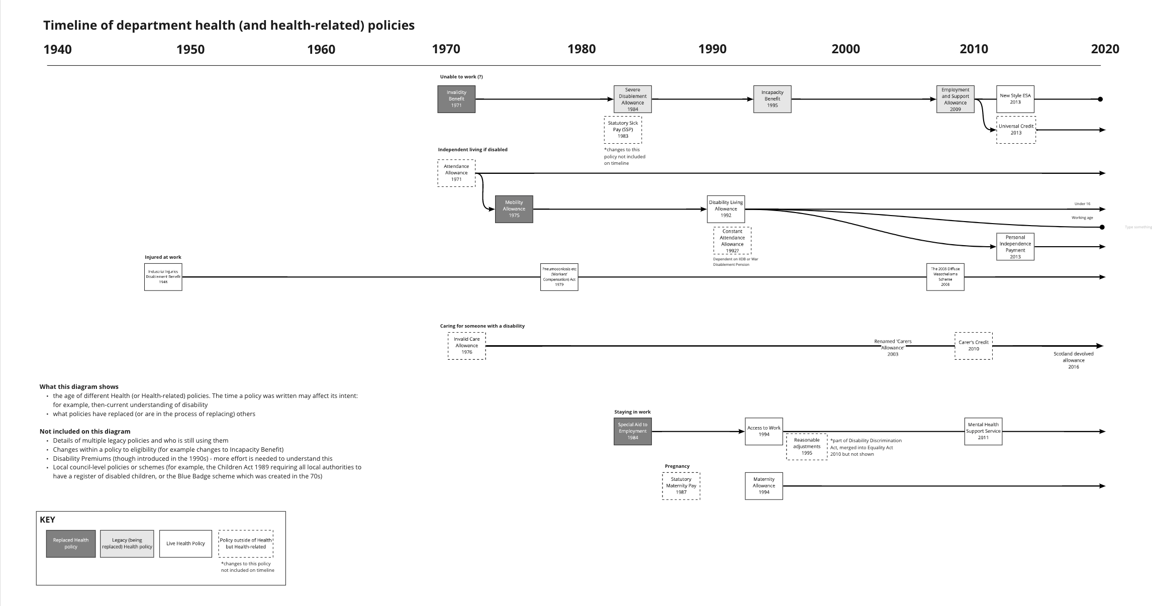
Did the timeline help ask more questions about similarities and differences in policies? I would answer yes. Looking at dates helps us do thought experiments:
- What did we understand of disability in 1948—the year the legislation for Industrial Injury Disablement was introduced?
- What did we understand of caring—what it was, and who did it—in 1976, when Carers Allowance was created?
- How do different policies from different ages—sickness benefits, overlapping caring benefits—intersect with each other?
Depending on the particular lens you want to take, it could be helpful to overlay other events—be it governments, legislation relating to identity politics, workers rights—so see if there are particular dates that serve as a ‘before’ and ‘after’ for comparing legislation.
Those who don’t know history are doomed to repeat it
I’ve seen some excellent timelines used for sense making, particularly from the National Audit Office. For example, I love their timeline of disability schemes on page 28 of their 2019 report of supporting disabled people to work. But I’d love to see more of this. To quote the (often misquoted) philosopher Edmund Burke “Those who don’t know history are doomed to repeat it.”
Member discussion