App Breadcrumbs
As someone who used to do a lot of web design, I’m familiar with the concept of breadcrumbs (enabling someone on a site to understand where they are on a site) and sitemaps (the catchall place for if someone can’t find something). However, I’d never really thought of it in comparison to normal desktop apps.
I’ve started learning an opensource app for some research, and was wondering why I was having so much difficulty picking it up. (I also disliked how it looked on a Mac so much that I learned how to change the icon and the splash screen, but that’s a different story). As someone who is mainly self taught when it comes to learning programs, I read the help menus thoroughly when needed, but also rely on the top menu as being the catchall for most things that you can do.
As it turned out, this app could barely be used from the menu bar. Most of the actions were hidden in the right click of various panels (and a few for video playback were only in the help manual!). I decided to see what overlap there was (shown in orange).
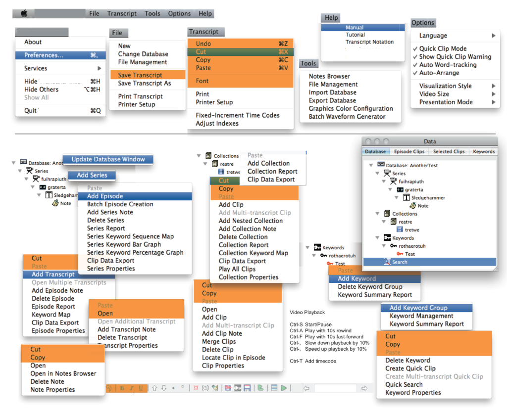
Pretty much the only overlap is Copy and Paste, and some formatting (which is actually a little different as well).
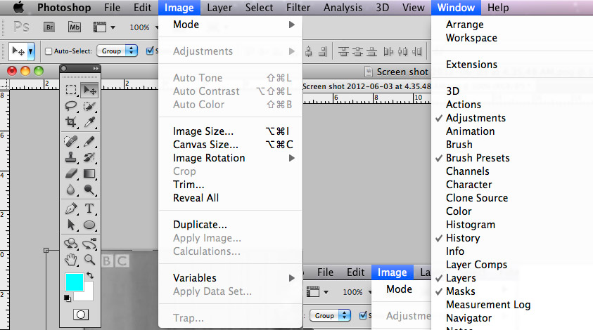
In comparison, the mightly Photoshop (the most extreme example I can think of) can pretty much be controlled with a combination of the menu bar and the Tools panel so that you can change selector etc. The Windows panel has a number of specialised panels that can be opened, but most are available at appropriate times to whatever you’re working on.
I realise it’s a bit unfair to pick on a community developed project (though I did pay $US70 for it!) and compare it to a heavily sourced commercial app. However, I think cases like these are interesting in showing what happens when the systems we take for granted aren’t implemented. I also suspect that this is something that may come into contention in upcoming years as the line blurs between tablet and desktop apps.
Member discussion