When Brand Identity Goes Too Far ...
I can't remember where I read it, but somewhere someone wrote that when it came to student protests, the placards by graphic design students – well laid out, clean, Helvetica – never seemed as compelling as the scruffy handpainted ones held by everyone else.
That thought came to mind with this picture of a sign put up by a bank in my hometown after it was robbed.
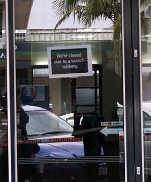
While the sign is obviously 'on-brand', it is disturbingly cheerful and polished for what you'd imagine to be a fairly uncommon event. (Yet ATMs often have scrappy pieces of paper over them with "Out of Order" you'd think these'd be far more common!) I think I'd have rather seen a hastily made up sign myself. (Image from www.stuff.co.nz ).
Member discussion