Talk: Andrew Byrom
The Cumbrian accent belied his long flight from California, where he’s based as a lecturer at CALU, but the English sense of humour was well intact as Andrew Byrom stepped the audience through his astonishing 3D type works and his enduring love for the Eames’ design duo.
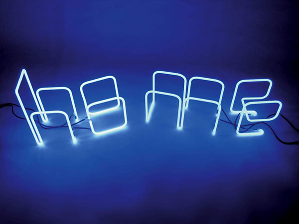
Byrom has been inspired throughout his design career by the Eames’s and their embrace of constraints, and has happily misappropiated Eric Gill’s statement that “letters are things“. He highlights this in his various experiments with materials and processes that ‘force his hand’ into unusual letterforms that he would never think of on his own. These range from his “Interiors” welded furniture with f’s falling over or his neon tube ‘Interiors Light’ (“see what I did there?”) pieces that involved heavy collaboration with fabricators, or just making it himself. (It doesn’t hurt that he worked in a shipyard for several years before studying graphic design).
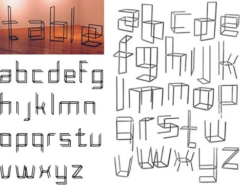
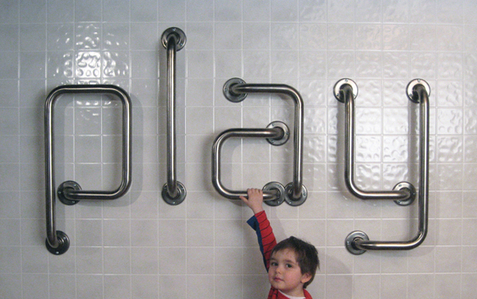
He encouraged students to prototype rather than just make things on the computer—he knows that his work could be made in Photoshop but actually wants them to be real and resolved to be a full alphabet—and to get used to failure in the sense that ideas may need to be revisited. He cites his St Albarn stencil kit for his son as inspiring his later Play (?) tubing set, and a temporary letterform idea blowing down the road leading someone else to exclaim that it looked like a kite.
“Design shouldn’t be about playing around. It should be awful, painful, trying to get ideas.”
He had a provocative statement for students: we need less time and less money as it forces us into action. He used the example of the Eames Museum project, where the extreme time constraints forced them to have ideas and run with them, even coming up with creative solutions (they needed so source a Jeep and realised that some had just appeared in the recent Captain America movie).
He admits that he’s always been drawn towards considered work since his student days where he made ‘ugly but interesting’ work, and uses his free time as a lecturer in a US university to consider his practice. He also actively discourages his students from doing internships, as he worries that ‘the real world’ can dampen their creativity (as he found that it did his when he was forced to work to tight deadlines and thus create work he wasn’t very happy with). Similarly, he’s done work where he’s asked for forgiveness rather than permission: he and a student created the first known works that used Eames’ words without a single Eames object (an interactive postcard and bandanna). The famously-restrictive Eames estate were shown nicely resolved work and signed it off.
“When you get a brief from a client or lecturer and you think ‘I know exactly what to do’, don’t do it.”
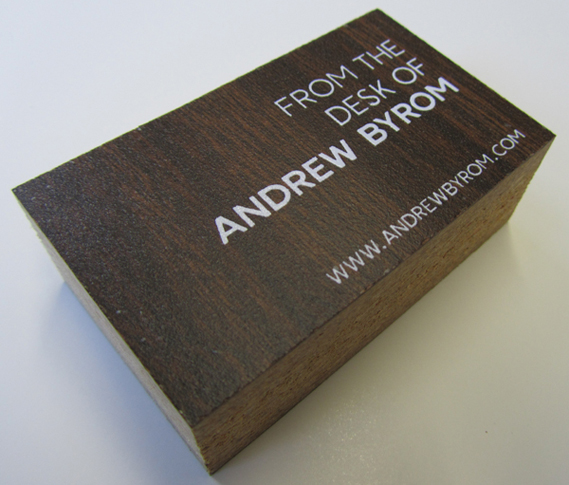
He also advocates that designers get used to self promotion… but without business cards. He uses competitions to get visibility for commercial work, and dedicates every Friday afternoon to doing so. He also believes that traditional business cards are of no use to designers (they get put away and found again when the person can’t remember you anymore) so always makes unconventional ones, from a face mask of himself that he handed out as a student and sat in an agency’s office until they called him to his current once made from his old desk so that he can say “from the desk of Andrew Byrom”.
One nice little Easter egg: he admits that the person lying on the towel in his UCLA cover is a sly reference to the person lying on the towel in the Eames’ ”Powers of Ten’ video.
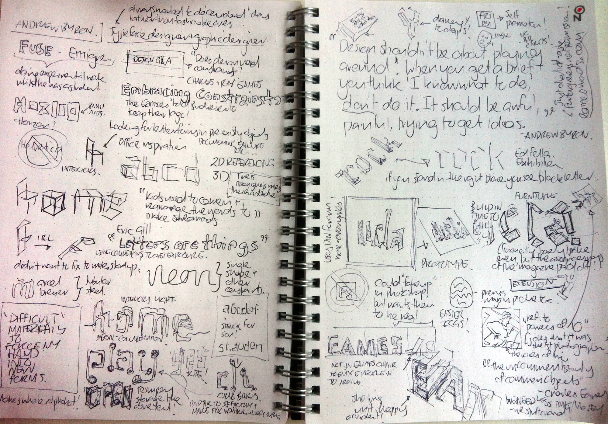
For those that want something a little more visual, my sketchnotes are below.
Member discussion