Interusability: Designing a coherent system UX for connected products
Watch out, your kettle could be stealing your wifi password! This is a true story, showing the concerns we have to deal with as everything becomes more connected. However, Claire Rowland also looked at less concerning but still no-less-important considerations.
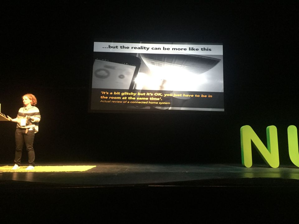
It’s amazing to think about how chips have become embedded into our landscapes, as motors did for the generation before them. However, this switching of simple I-O (on/off) for more remote controls can be problematic. There can’t be anything much more frustrating than a light switch app that doesn’t necessarily give accurate feedback “it works if you’re in the room as you can see it”.
For all of this, we’re still figuring it all out in terms of UX. It’s because it’s complex.
There were some key elements Rowland brought up.
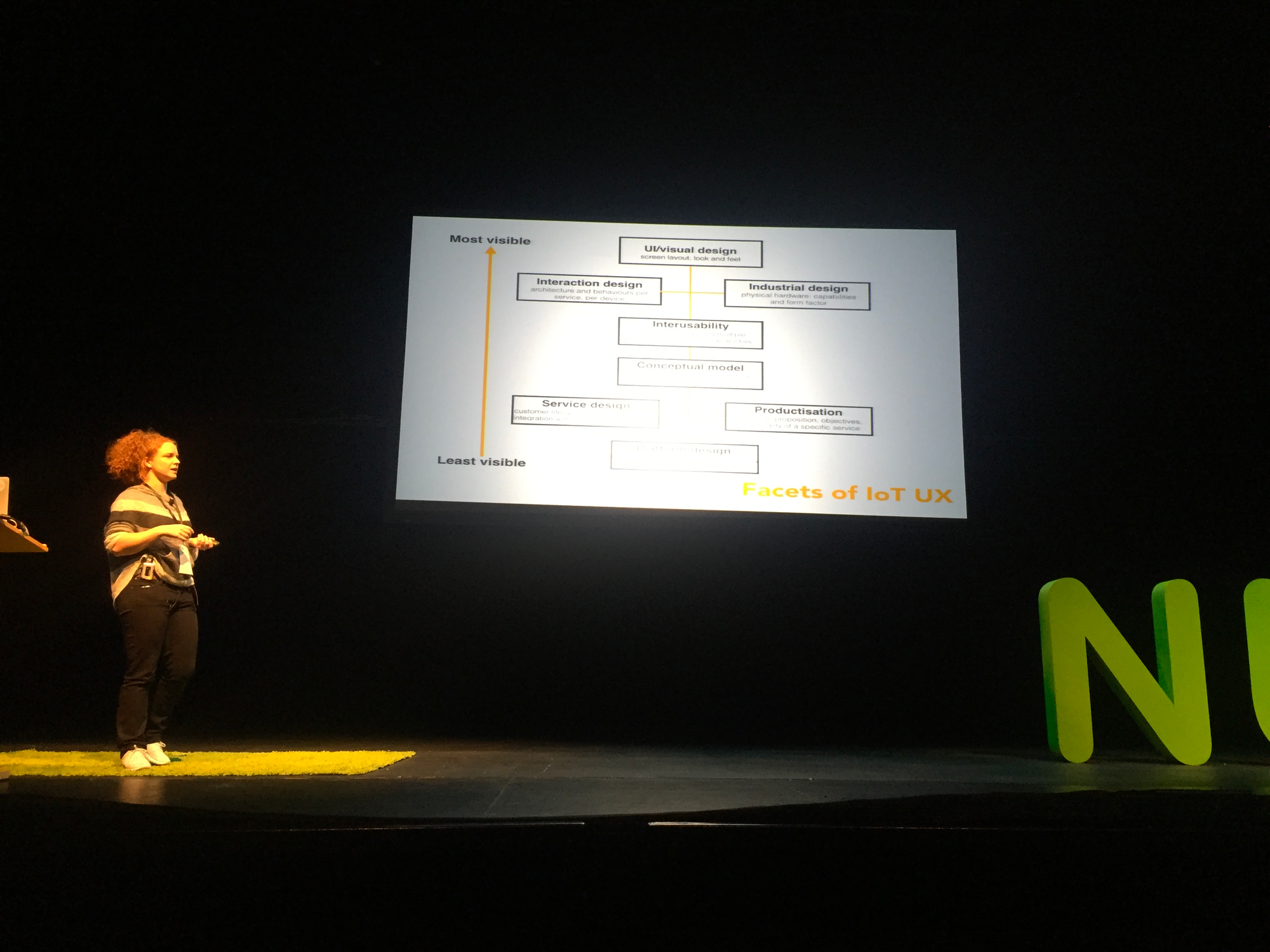
Rowland uses the phrase ‘interusability’ (taken from a mobile CHI paper) to encompass the rule that you don’t have to do the same things at different places, but they should work with each other. I’d add another one: ‘coupling’. A tightly coupled system allows for seams to show (the system may break there may be a delay), but also handles them.
No matter the phrase we use, she noted that companies face two business models when it comes to connected systems – designing systems with controls on both hardware and apps; or making most if not all controls from the app. The latter is more expensive and risks obsolescence, but is easier to use; the latter, cheaper but not always user friendly. As Rowland has found herself, a cooking scales with all controls delegated to an iPad app isn’t much use when your iPad is in a different part of the house!
Similarly, when it comes to feedback, there are two options to make it less of a black box when things happen: either make the interactions obvious (show if wifi is on and off etc) or, just make the system deal with problems better.
The big consideration for connected IT is that between I-O moment of data transfer (liminal state). What if things go wrong? What if it feels as if it’s taking too long? You have two ways to surface this:
- Tell a white lie (or, the harried spouse saying “I’m at the car” as they walk out of the office). This is the instagram model where you say something is done when you push the button, and then only otherwise if it’s a problem. This is good – but problematic if something super important does go wrong.
- Be honest. Say that it’s “sending”. This can be frightening as it brings in ambiguity – but in critical situations this honesty could be key.
For the examples above, Rowland suggests using them in different cases. For a pace maker, any problem should be shown straight away, so be honest. For things such as sprinkler kits, a slight delay isn’t the end of the world.
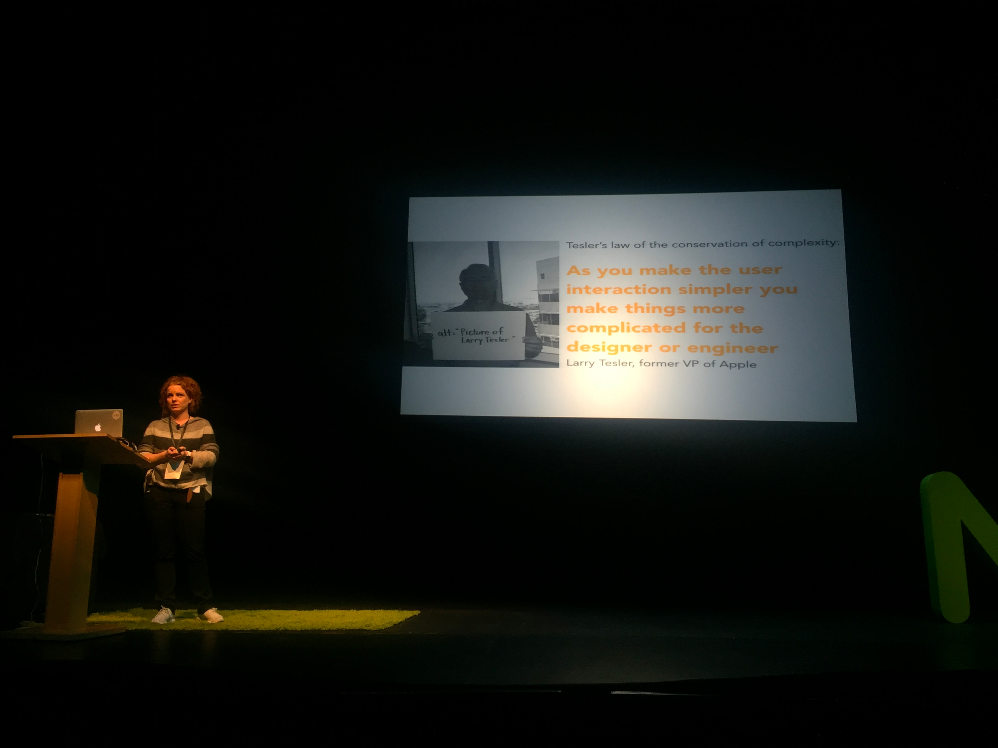
Above all, the holy grail for simplicity puts the challenge squarely in the designers’ camp, as her final slide aptly summed up.
Member discussion