Infographics Done Right: Cards Against Humanity
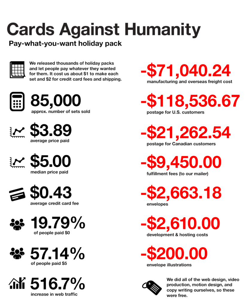
The recent surge in infographics has been good and bad: for every carefully analysed and designed interactive graph there’s been even more infoposters that are harder to read than just having the information in written text. However, Cards Against Humanity get the balance informative vs entertaining just right in their recent infographic about the money that was raised during their recent campaign where buyers chose their own price.
See their site for the rest of the graphics (keep an out for the ‘pie chart that looks like pacman’!)
Member discussion