Design and uncertainty
There have been a few blog posts recently about how discovery can include design. This coincided with some work I was doing to explain why some design work could go to development even if it hadn't been tested, while some others might not even be appropriate to usability test yet.
Talking about uncertainty
A few people have been writing about uncertainty and delivery such as Kuba Bartwicki and Steve Messer (and yes, this will get cyclical as he mentions me).
There are a few models that I've been using over the last few years to talk about how some things are more uncertain than others.
Three Horizon Model (McKinsey)
This is a model that I've known about since university: I've always liked the McKinsey 3 Horizons model for reminding businesses that they need to both plan for the near future but also what may be happening further ahead, and that the further ahead could head off more immediate ideas.

Wardley Maps (Simon Wardley)
Businessman Simon Wardley created Wardley Maps as a way to help businesses decide buy vs build and other efficiency vs innovation business questions.
I particularly liked models that he's put out to help teams understand when to use Agile, Lean, and Six Sigma.
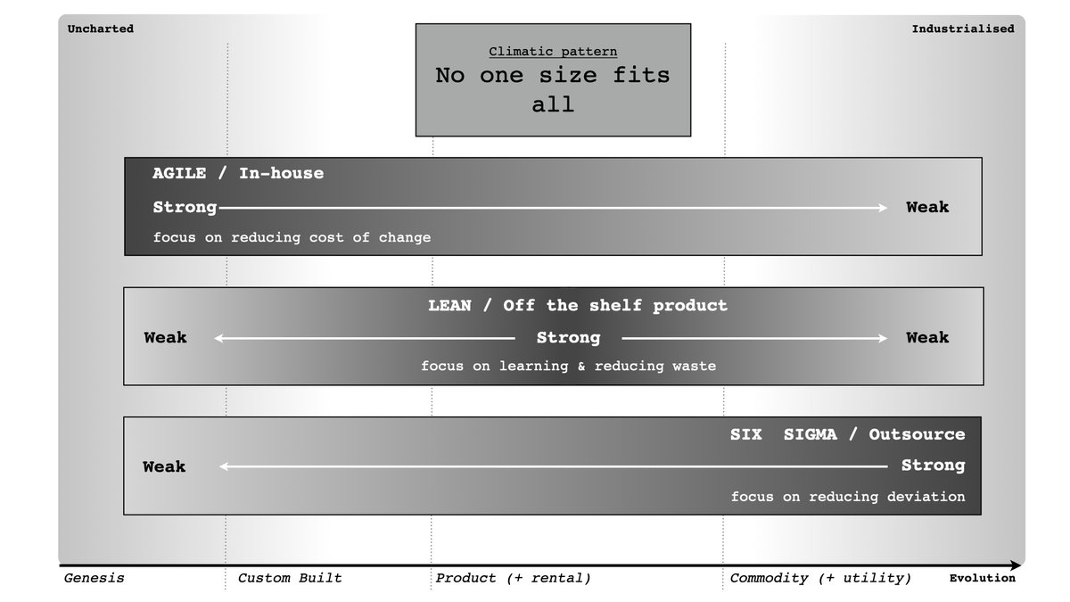
Wardley has other metaphors such as pioneers, settlers and town planners which are helpful in considering change.
Cynefin (Dave Snowden)
Cynefin (said, kin-ev-in: it's Welsh for 'habitat') is a problem framing model created by former IBM management consultant Dave Snowden.
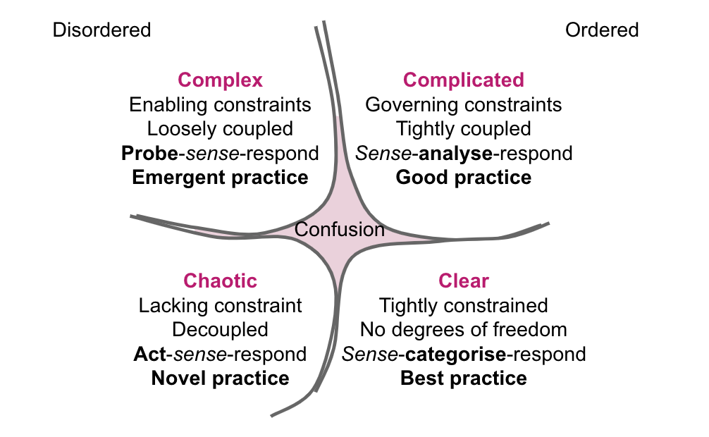
It's a bit of a weird one to use in a lot of circumstances, but what I find useful is the reminder that somethings it's better to do something rather than wait to do analysis.
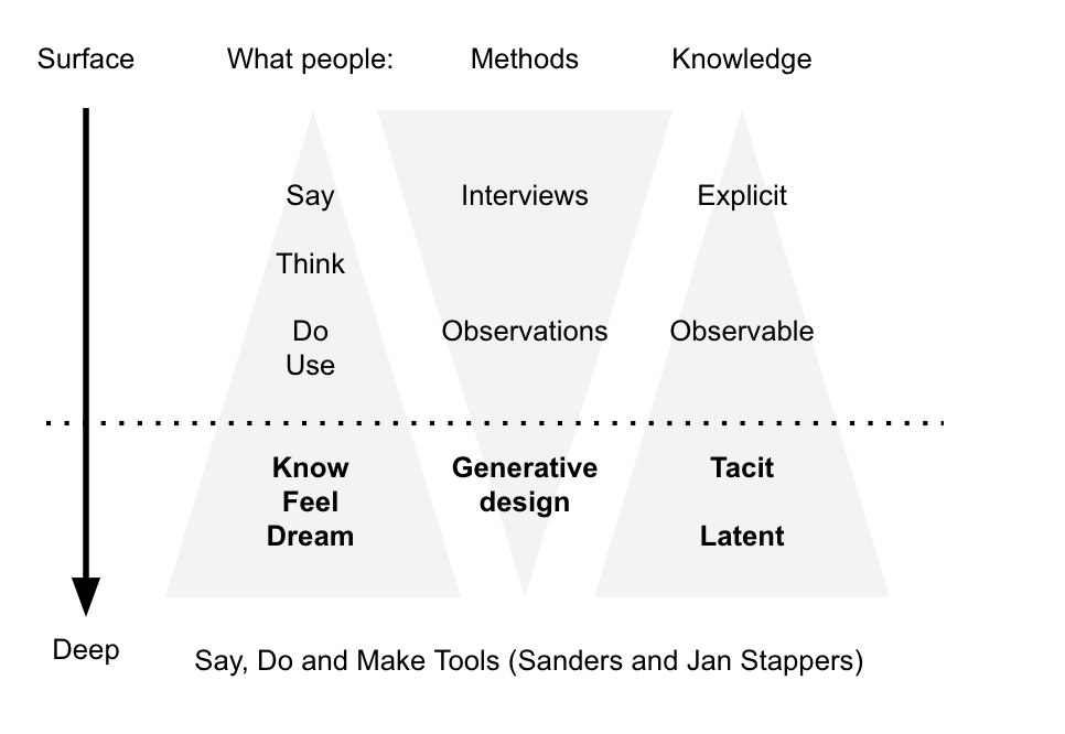
Say, Do and Make Tools (Liz Sanders and Pieter Jan Stappers)
This is something of a model that doesn't have anywhere near as much attention as I think that it should, possibly as it's in a (gasp!) printed book from the 2010s: The Convivial Toolbox. Liz Sanders and Pieter Jan Stappers, using work from Dutch university TU Delft, use this model to explain why sometimes we need to let people make things just to learn about it.
This is a model that can be reflected in design thinking—though I think that people sometimes miss that design thinking is about learning rather than solutions.
Hypothesis prioritisation (Jeff Gothelf)
Looking more to the startup world, I enjoyed a lot of Lean UX as popularised by Jeff Gothelf and Josh Seiden, but the tool I've used the most with designers is Gothelf's Hypothesis Prioritisation Canvas.

More than anything, it's a way to remind people that not everything has to be tested - though I do find it hard to use the bottom half of the grid much.
There are also models for scoring ideas such as ICE (Impact, Confidence, Effort) and RICE (Risk, Impact, Confidence, Effort), though I feel that this is more about investment in bets rather than actually making decisions on the type of work to be done.
My contribution to the model—design triage
While all of the above models have informed my work, when it comes to helping public sector designers decide when they test and when they ship, I've found a few things missing:
- some more heuristics to understand when to ship in a world where getting it wrong could mean real harm
- means to help people understand that it's necessary to do testing on concepts, even just to learn about them (the closest that gets to this is Sanders' and Jan Stappers' Say Do and Make Tools, but it's a bit too 'design lab' for everyday use)
- general questions to ask to make decisions on what to do
So this is my model as of January 2024.
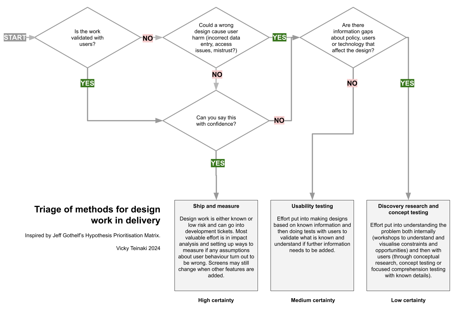
It helps to give some questions and order, and also remind people that it's actually cool to do testing of ideas, just with the reminder that it really is ideas and as much about generating more ideas for responses as anything else.
There's a Google Drawing of my model available.
Member discussion