Affinity mapping, digitally
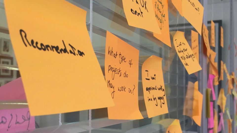
Post-it notes. Love ’em or hate ’em as the designer cliche they are, they’re great for helping create insights from data. Particularly for affinity mapping. The Government Digital Service recommend using post-its to make sense of usability tests. However, what do you do if you don’t have a massive wall?
I decided to tackle this. I needed to find themes from the 3-day UX Scotland conference. Having tried out collaborative note-taking for the first time, I didn’t have the stream of tweets I’d usually use. What’s more, this was the first three-day conference I’d done this for (in the past UX Scotland was 2 days). What could I do?
What makes post-it notes so good for affinity mapping?
I decided that I’d find a web-based way (I use a Chromebook when out and about) to do affinity mapping. But what did I need? I decided that the key attributes of post-its for affinity mapping were:
- concise
- scannable
- colour-codable
- easy to move around and manipulate
With that in mind, I looked at a few options.
- Spreadsheets could be a start, but are a bit scary
- Mind-mapping software is good for generating ideas, but less so for moving them around. Also, I was dealing with over 15 talks to pull themes from
- Qualitative analysis tools such as Optimal Usability’s Reframer or NVivo could be helpful, but were not very visual. Reframer is web based but others were software
- I could have built a website to pull information together (for example with Drupal) but this seemed over-the-top
Giving it a go
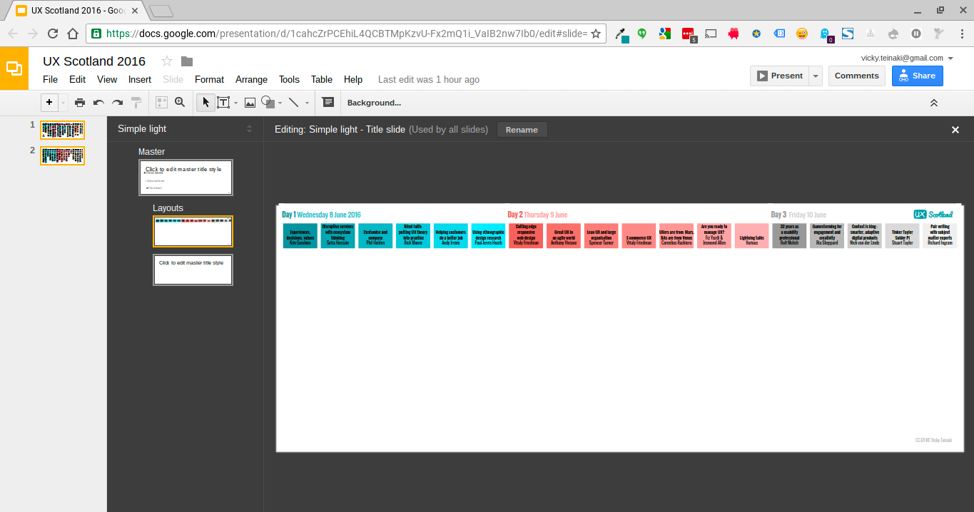
So, I decided to use … Google Slides.
This allowed me to:
- Create boxes of themes
- Colour code them
- Copy the slide and then create themes from them.
My initial attempt wasn’t too pretty
Affinity mapping themes for #uxscot. Don't have access to a big enough wall, so using google slides! (group next) pic.twitter.com/4PL09ofMyZ
— Vicky Teinaki (@vickytnz) June 19, 2016
But after setting up some colour steps
I was able to make something that was both a design artifact and color-coded.
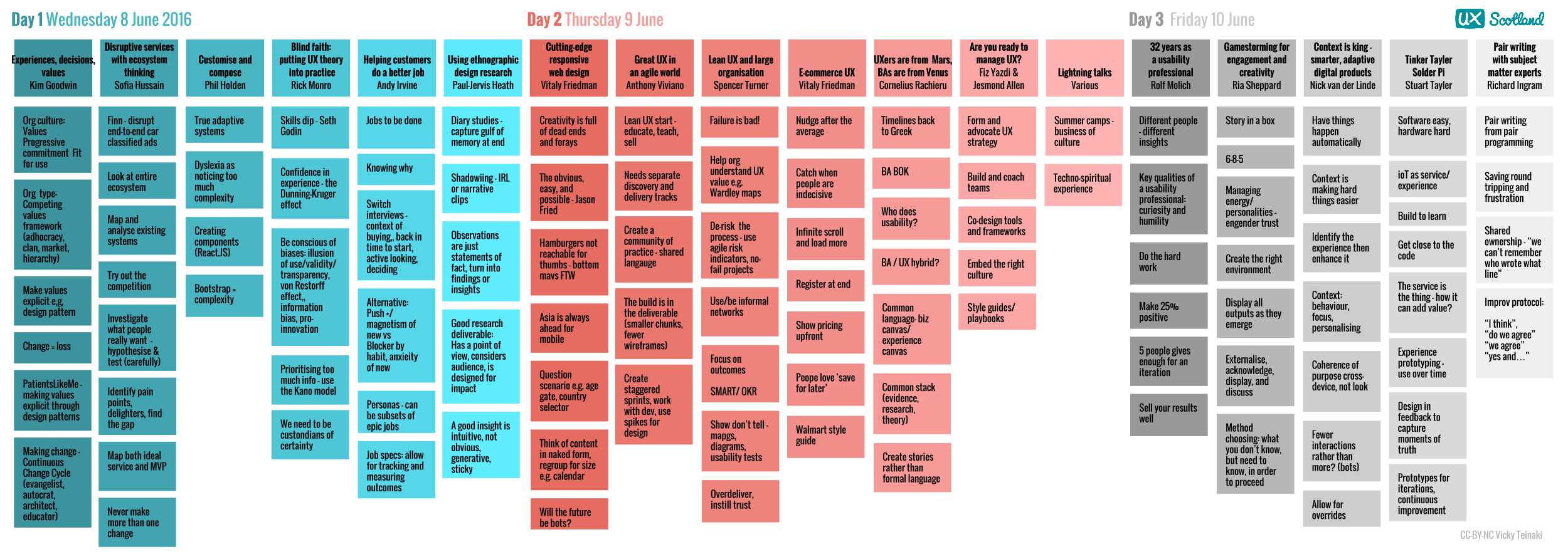
Then, I copied the page and moved the points around into themes
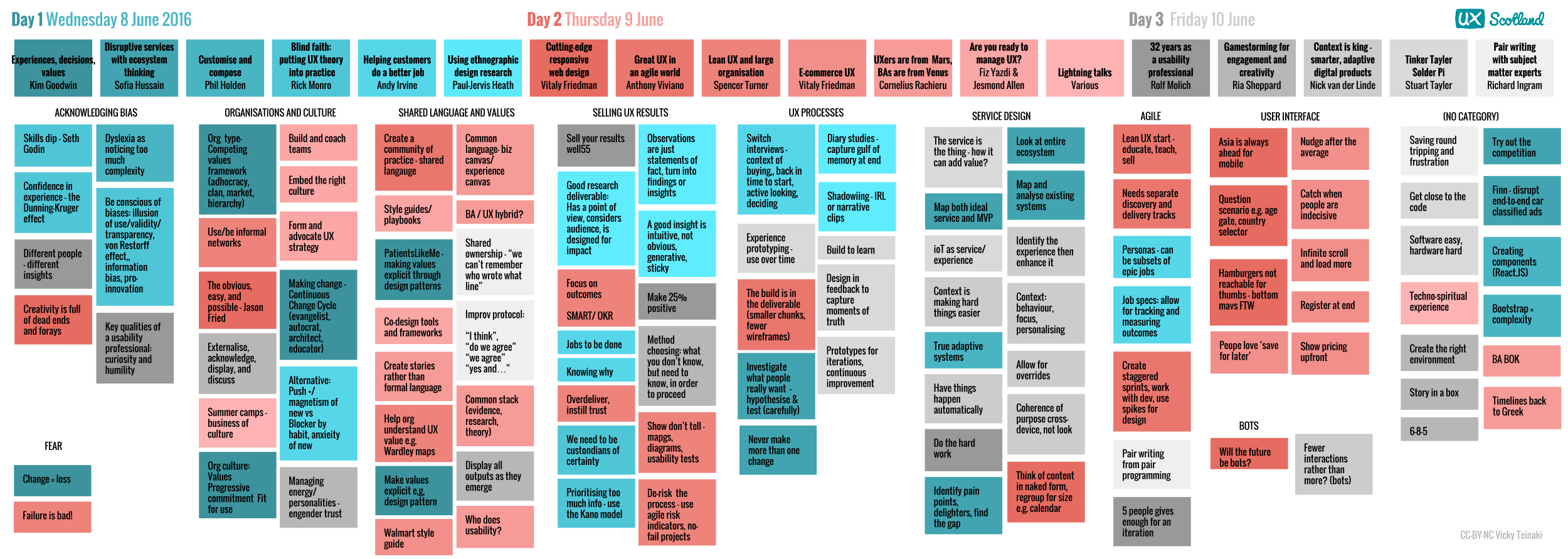
The themes aren’t perfect. If this were a client deliverable, this would be reviewed by other people. And as Rolf Molich has pointed out, different people find different themes. (This is particularly true with multi-track conferences since other talks would promote different themes).
Still, this was an interesting exercise, and was a great help for the blog post I wrote about the conference.
My Google Slides presentation shows that it’s not difficult to do.
What I’d explore more
I am aware that this may seem like a whole lot of work for not much return – particularly since if you just take action-oriented notes you could possibly skip this in the first place. However, I feel that active meaning-making means that you actually process the information. (And you can choose what not to write about).
I also feel that the sense of seeing things at a glance and being able to move them around is one of the things that is missing from digital tools. On reflection, I wonder if something like Trello could be manipulated to do something like this, but the key thing I couldn’t see was the idea of two levels of tagging. (Maybe Evernote does something like this? I’d be keen to hear).
However, what I am proud of is that it’s possible for free tools to create things that look half decent. I’m a strong advocate for making all artifacts look designed (or at least enough to be on brand and follow good design practices). It’s entirely possible to make things in Google Slides or Microsoft Powerpoint that look as good as something in Illustrator. I’d recommend all people read Edward Tufte’s Envisioning Information or Nancy Duarte’s Slideology.
Beyond this, I also wonder if there’s something to be said for affinity mapping conferences as they happen. Could we see themes emerge then? Could this happen physically or even digitally?
Member discussion