10 (plus extra) UX Changes for Every Drupal Site
Drupal is great, but UX wise, there are a few issues with it out of the box. I addressed these in my Drupal Camp North East talk at Sunderland Software Centre last Saturday. My slides are available on slideshare, but since the talk isn’t available as video (just quietly, *phew*) here are my notes that went with the talk.
Damn you Slideshare for not letting me include speaker notes from anything apart from PPT, and not accepting a converted Google Slides document!
Slide 1
Hello everyone, I’m Vicky. I’m a UX designer (at Orange Bus) a longtime Drupal designer and dev (since Drupal 6, I think my first Drupal site was in October 2008, a personal blog that I completely ruined. Luckily I learnt a bit more after that!).
Slide 2
Drupal is great for a lot of things, but usability isn’t one of them. Admittedly, it’s a lot better than it used to be – for anyone who remembers Drupal 6 – but there are still a number of issues that are always worth ending up getting fixed: and in fact are often one of the things that makes it clear to me that a site has been built on Drupal. Well, that and that Webalyser on my computer shows it up as being Drupal.
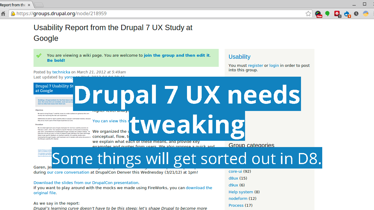
I’ll admit that there’s been a serious push on usability for Drupal 7 and that a lot of this is being actioned in Drupal 8, as Adam pointed out earlier today with a lot of the changes happening with Drupal 8. (I know that Leisa Reichelt, the head of gov.uk and one of the two designers involved in the Drupal UX project a few years ago, has noted that a lot of the things they pointed out have started getting pushed through now). I’ve seen that some things I’ll talk about today are going to get fixed (hopefully) in Drupal 8. However, most of us are still on Drupal 7, and will certainly be supporting them for a fair while.

Slide 3
I’ll admit that this is based on a combination of my own experience as a Drupal developer from the last few years, as well as some of the changes that our UX team at Orange Bus always implement on Drupal sites we build or end up picking up when clients have existing sites running on Drupal. However, our developers tend to custom code a lot of options, so the modules I suggest are often my own experience rather than our agencies. I have used most in the past and tested all of them, but I felt that it was important to provide easy options for site builders to implement rather than just saying ‘go talk to the devs’.
I’ve also focused on front end options rather than back end, for that I recommend looking at the fantastic set of modules put together in Tasty Backend by Jenny Tehan.
Slide 4
On to the 10!
Slide 5
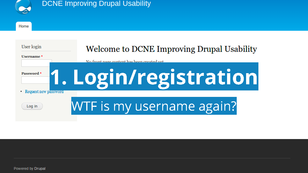
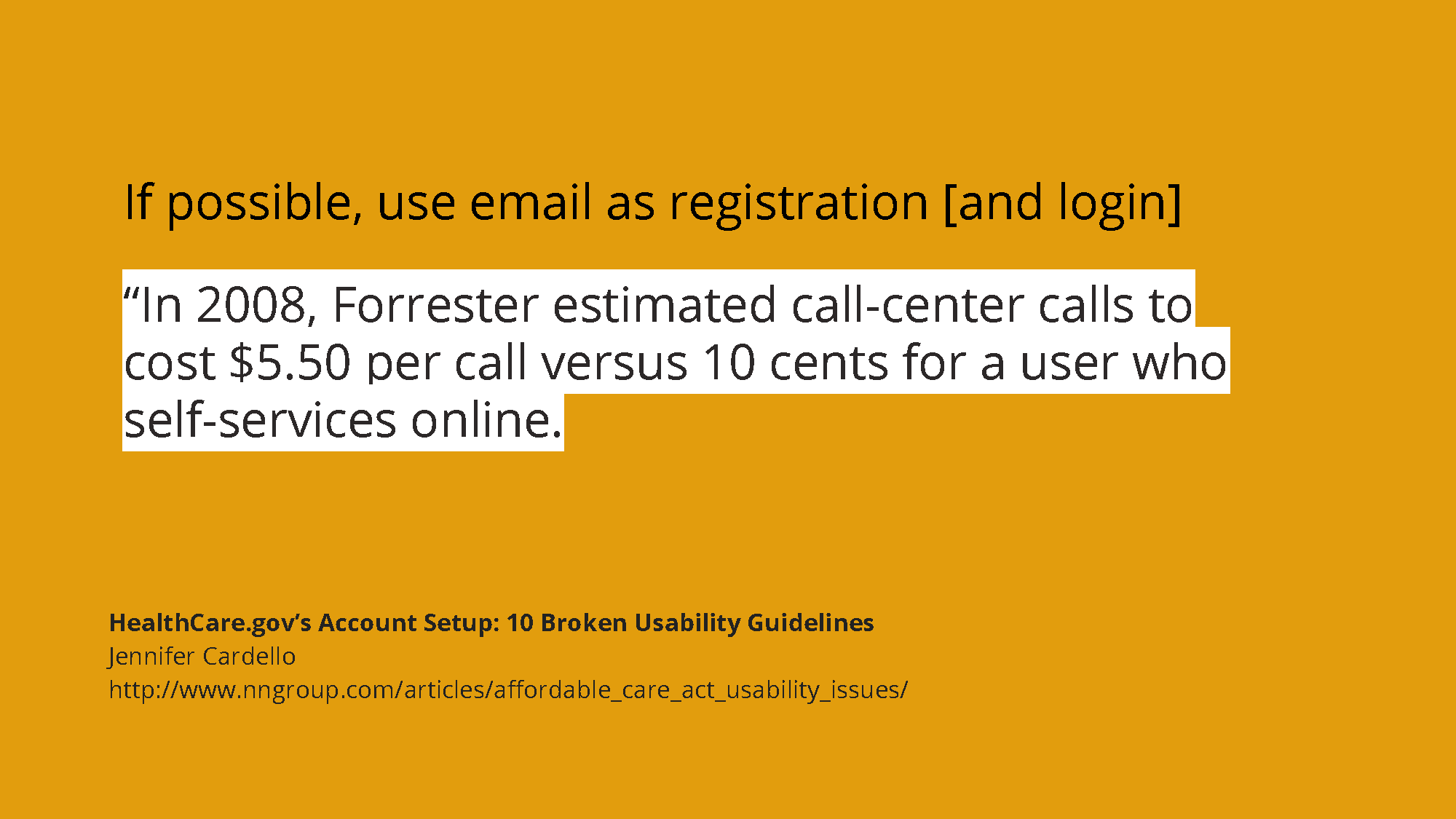
I read a post from a few years ago complaining about why for some reason Dries had decided that usernames could have spaces rather than the standard ‘no spaces in username’ pattern. The entire issue of usernames is problematic when it comes to sites that you don’t go to very often: the old ‘what on earth did I register this as’?
Slide 6
To be fair, this isn’t specific to Drupal. This is from a damning review of healthcare.gov (not a drupal site) where one of the many things they pointed out as being wrong was that people had to select a user name to register. This is a particular issue with ecommerce where not having a guest checkout is likely to make people leave.
Slide 7
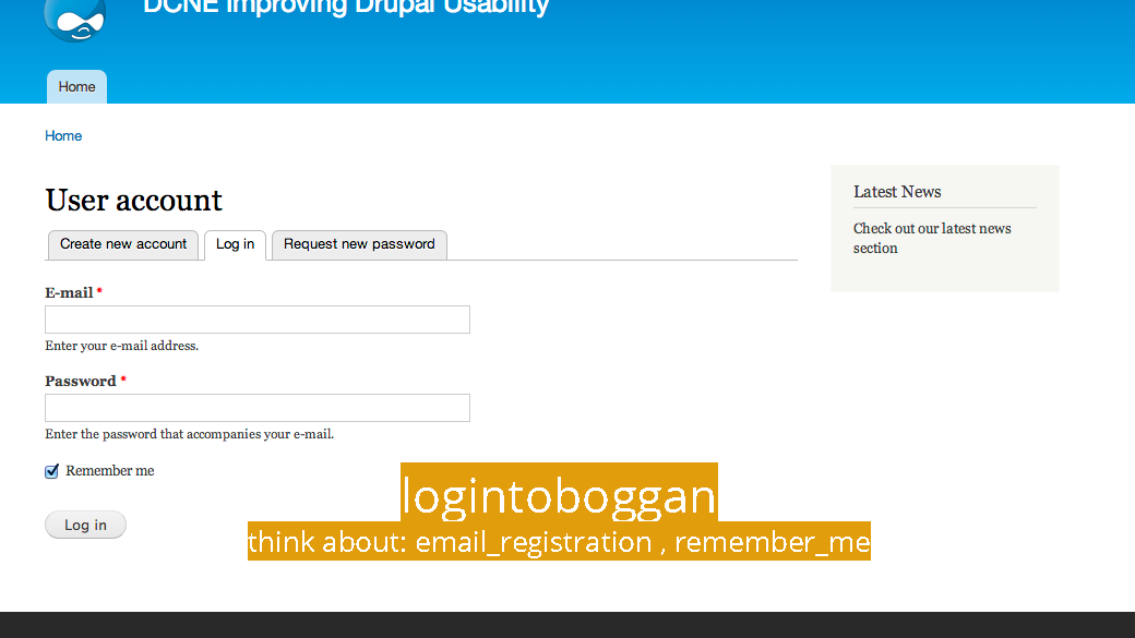
Luckily there’s a fairly well known and reliable answer to this: logintoboggan gives you a lot of options that all help with usability: it allows you to log in using an email address as well as a user name, and a lot of other great details that I’ll discuss later. Some other ones to think about are: email_registration: which completely removes the need to set up a username at start: it guesses at one based on your name which you can change later.
Slide 8
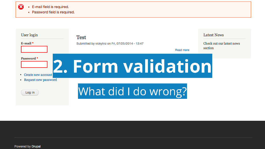
My colleague Joanne Rigby previously worked on the TV licencing site which was all about forms, and as a result we’re pretty thorough when it comes to checking them. However, out of the box the Drupal validation system is problematic: it shows errors on submit and at the top of the page. It’s not always the best languaging either.
Slide 9
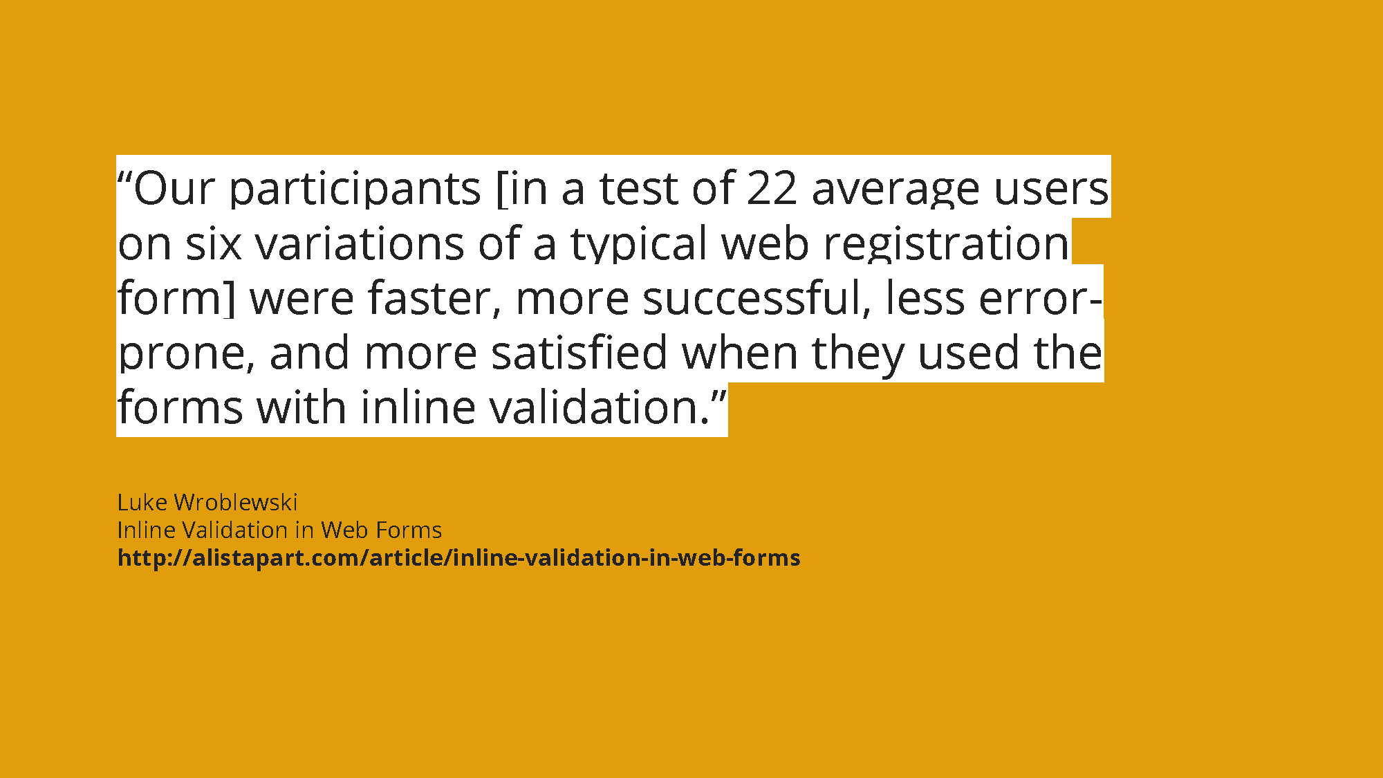
Luke Wroblewski is the UX form guru (as well as possibly the mobile guru) and has done a lot of evangelising for form usability, and has shown that good validation makes a difference. We’ve also found this doing tests (namely that often sites without good validation were harder for participants to use and so they were slower).
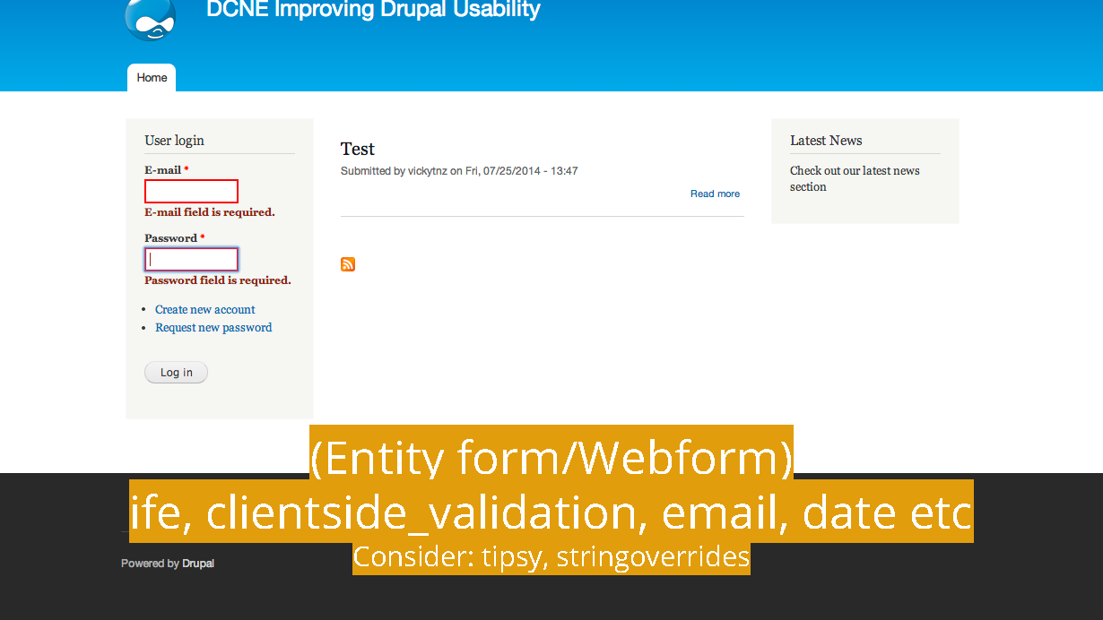
Slide 10
In a lot of situations, we’d amend the theme and/or write this into a custom module with hooks. However, for site builders, inline form entity and clientside validation work well together (though you do have to turn on ‘on blur for all fields’. It’s also worth looking at tipsy, which moves the help text into a tooltip (though I would be careful with this and test as it can be overwhelming if you have lots of text), and dramatically string overrides which will let you change some of the text in the validation fields.
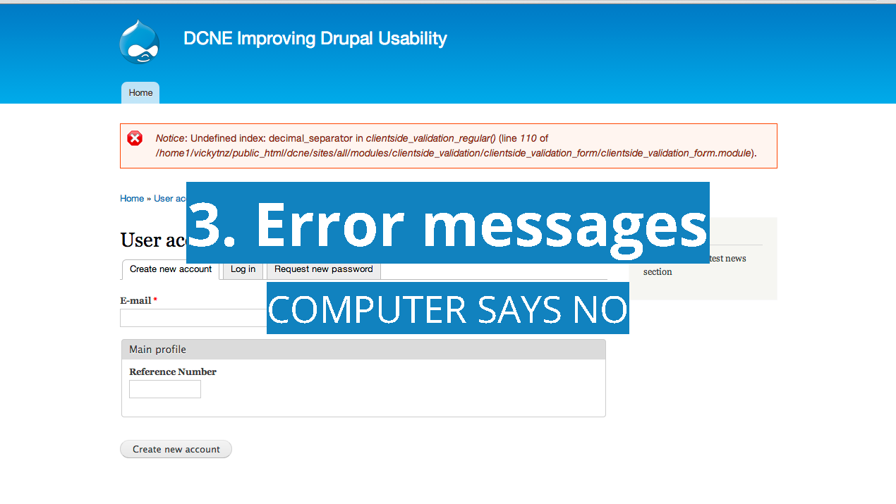
Slide 11
Drupal sites spitting out computer talk doesn’t exactly inspire confidence in someone using a site. There are different types of errors: the errors where a user may have made a mistake (e.g. 404s) and those where the computer has made a mistake.
Slide 12
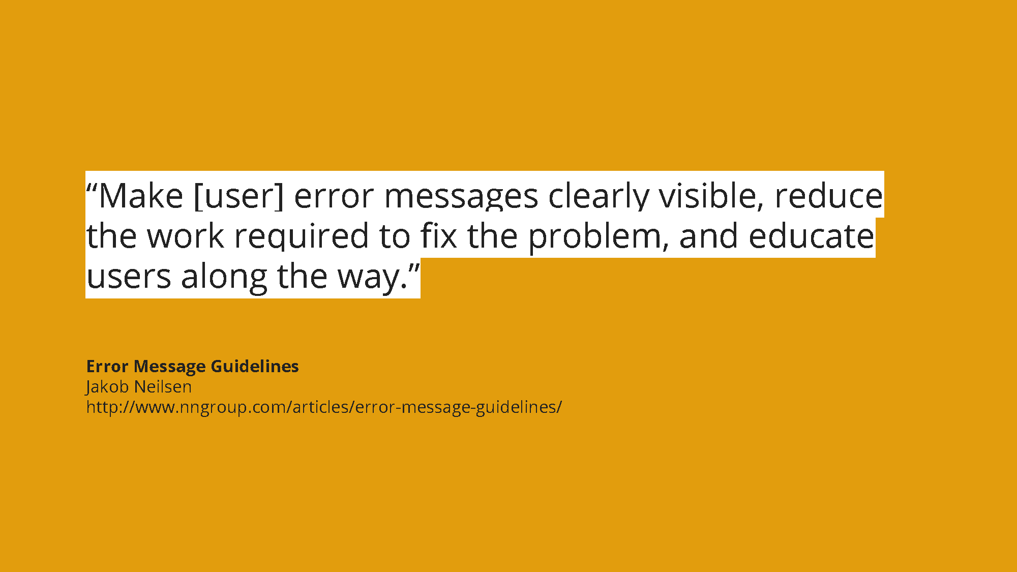
For those that don’t know, Jakob Neilsen is the grumpy old man of usability (apparently wasn’t always grumpy, but that’s another story for later). However, NM Group gives a lot of useful guidelines.
Slide 13
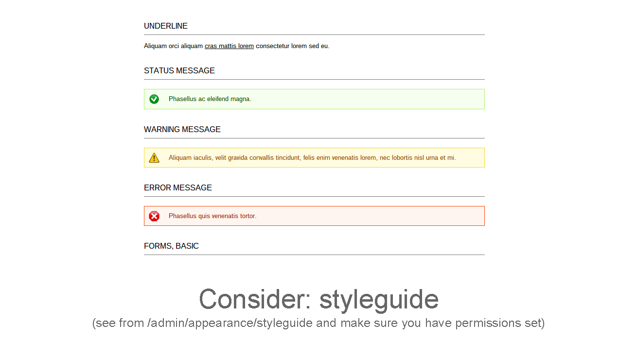
One element of making user elements visible and helpful is ensuring that they’re appropriate and feel like the site rather than the CMS is talking to you. I say this particularly because it’s easy for error messages to miss being themed. In this respect styleguide is useful in showing base UI elements that a theme uses to check for.
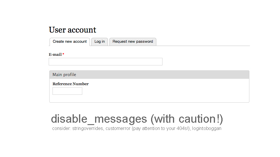
Slide 14
For those messages that shouldn’t be seen, you can either amend in your theme or use the disable messages module. I would use this carefully as it doesn’t always differentiate between user and system errors: and users can miss important information (though this is captured by the clientside_validation and ife modules).
Slide 15
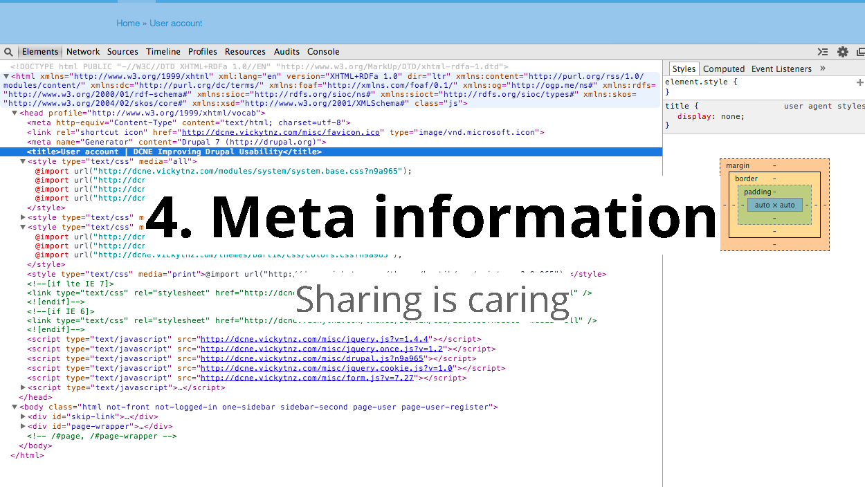
I know that meta information can seem as much about SEO as UX.
Slide 16
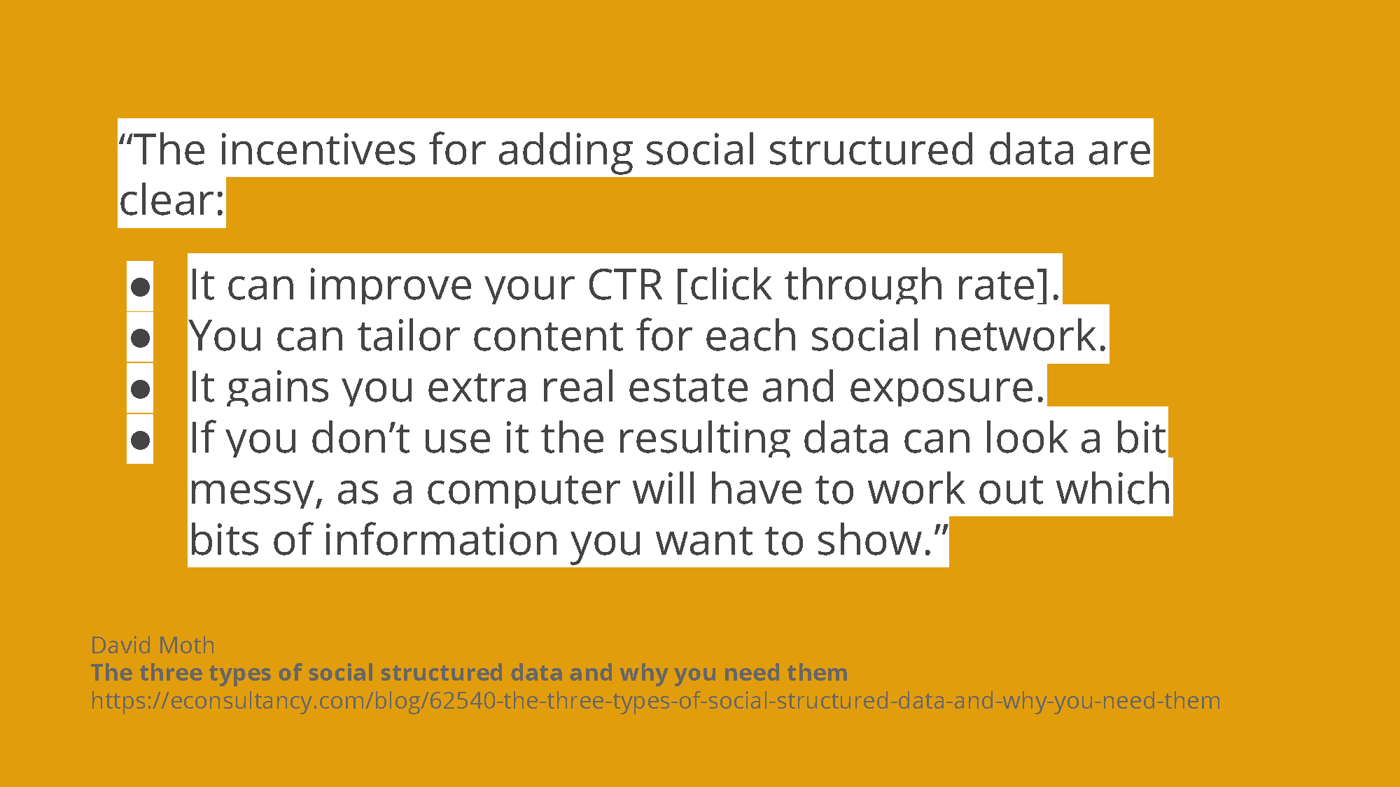
However, I bring this up as there are different things to consider when it comes to metadata. While some things such as page titles and page descriptions are part and parcel for Google, the game is shifting so much that they’re starting to become less important. We’ve always advised our clients that good content is good SEO. However, the rise of social media means it’s worth getting things looking good for the various networks.
Slide 17
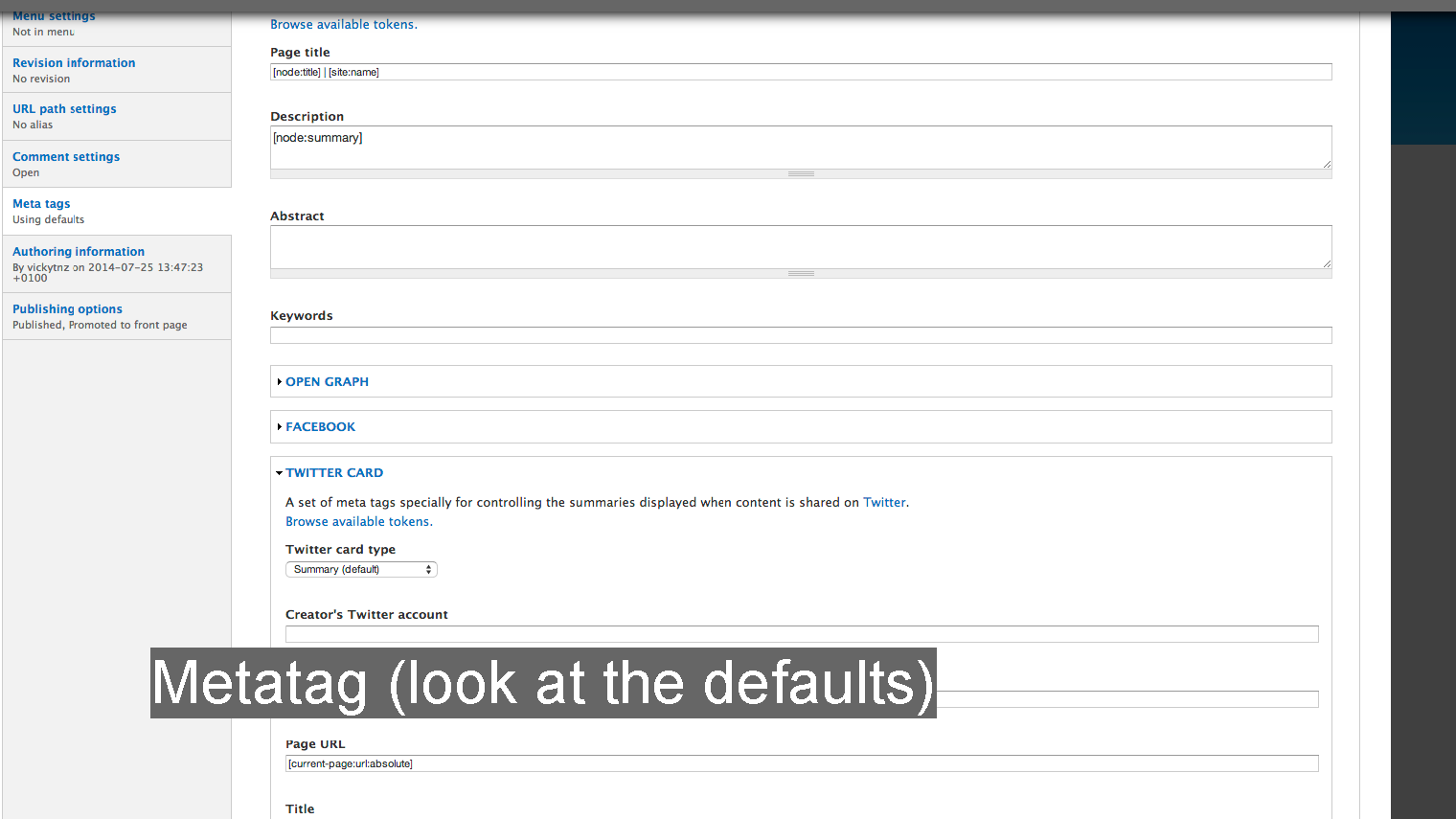
The metatag module gives you good options for considering these things off the bat. I haven’t added is as I haven’t had a chance to investigate it yet (and am waiting for a Drupal project to investigate) but there’s a module for structured data on Drupal so that you can create a ‘content once publish everywhere’ COPE system.
Slide 18
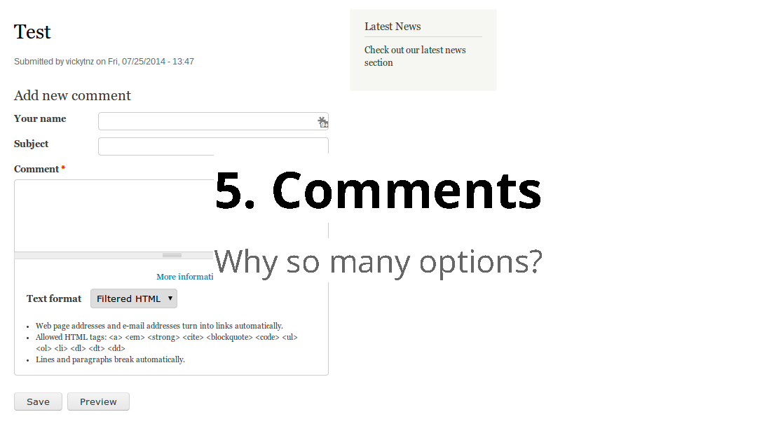
Ah, drupal comments.
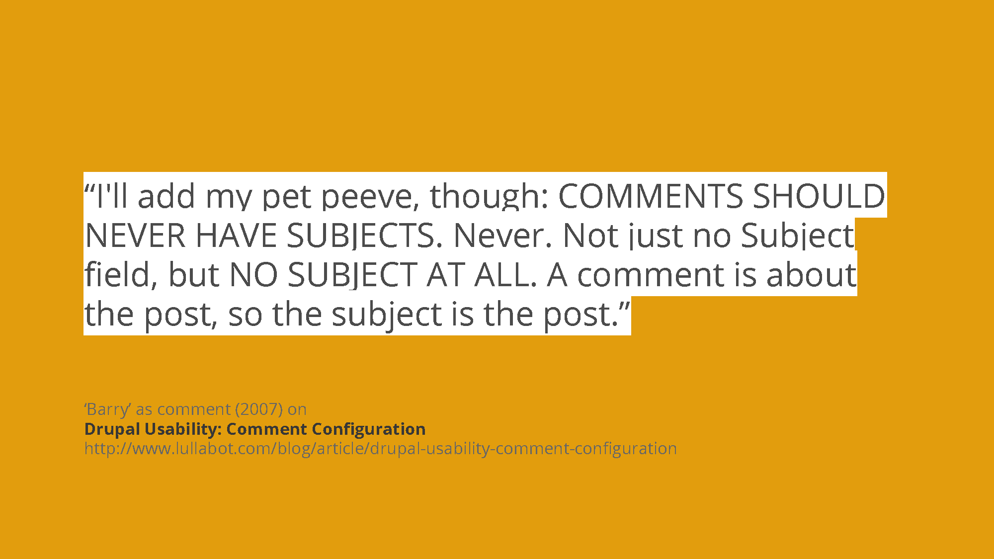
Slide 19
I have to admit I added this from doing search on online as I know personally I’ve always hated that Drupal by default expects comments, and other people have been vocal about this too. For years. I don’t think I’ve ever done a wireframe that has a subject header for comments!
Slide 20
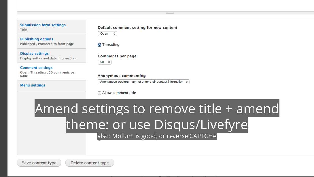
Sadly this is the one example where as far as I know you do have to amend the theme. I have to admit it’s always an option that’s felt incredibly buried as well.
There are also other options.
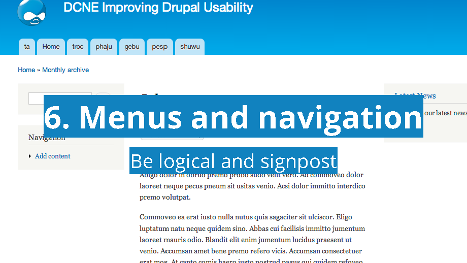
Slide 21
Menus and navigation for Drupal aren’t as logical out of the box as they could be (though they’re better than some such as WordPress).
Slide 22
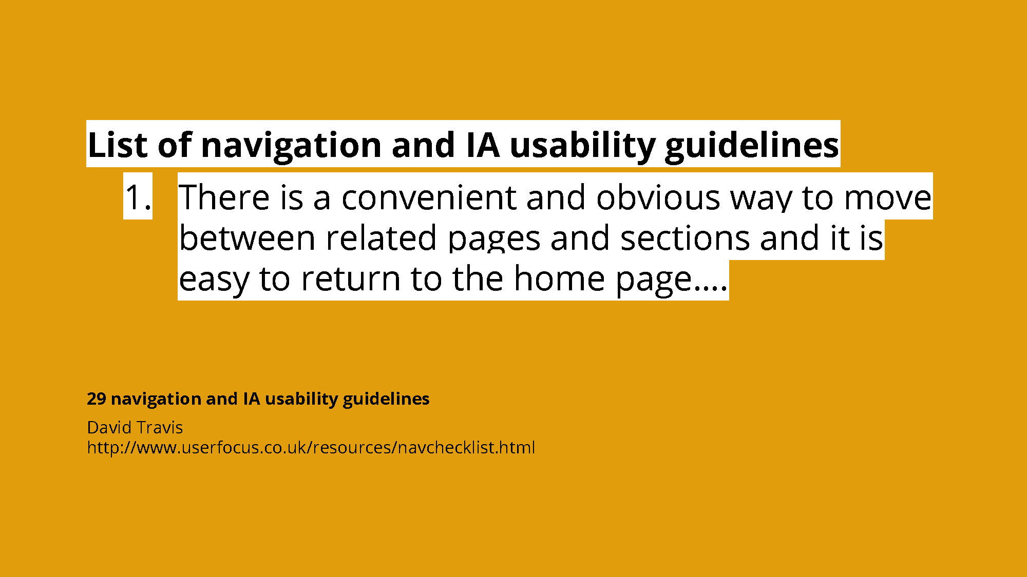
David Travis’s navigation and IA usability guidelines are a useful reference in general, but his point on relating to pages in particular is of relevance to Drupal.
Slide 23
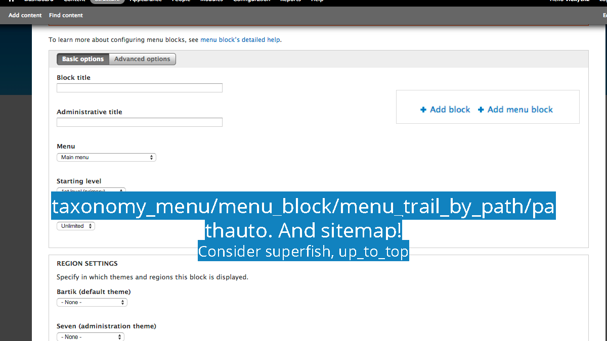
Of particular relevance here are the taxonomy menu module, menu block (which lets you see contextual menus), menu trail by path (which sets the parent navigation for a page), and of course pathauto.
It’s also worth looking at the superfish module for supernavs, and up to top to let people get up to the top of a page.
Slide 24
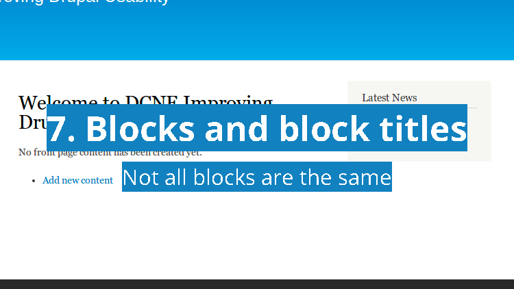
For me block titles are a personal bugbear.
Slide 25
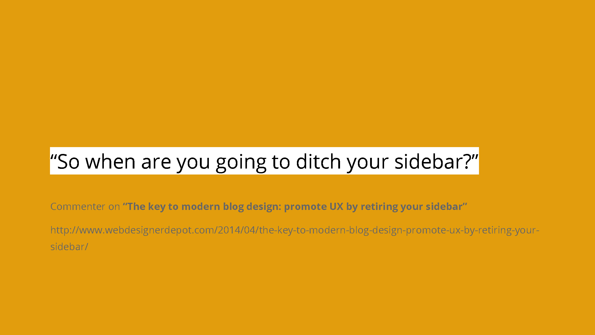
I put this quote more as an aside. As much as there’s a leaning towards removing sidebars on a lot of tech blogs: but this isn’t happening with a lot of more commercial ones. Sidebars are still here for now.
Slide 26
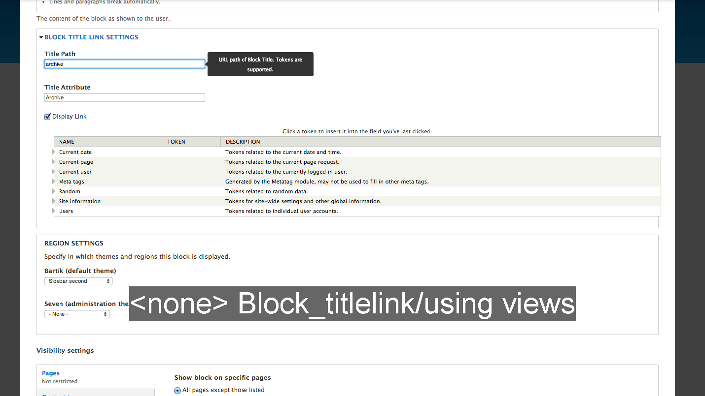
If a block is a link to a particular page, the block title link module lets you link to it in the title. (If it shouldn’t have a title, good old will let you get rid of it.) Otherwise, views is a useful way of better controlling the titles.
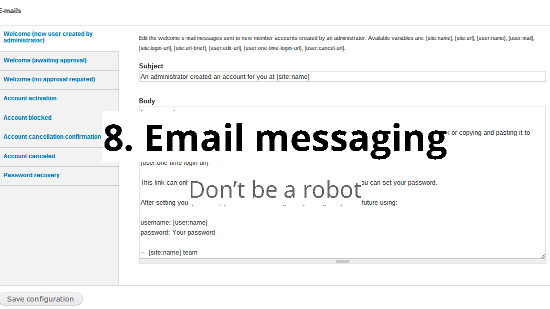
Slide 27
One of the things I notice with Drupal run sites is that the transactional emails that come from it out of the box are pretty robotic. It’s easy to forget about them, yet often it’s the first and primary way that people interact with your site.
Slide 28
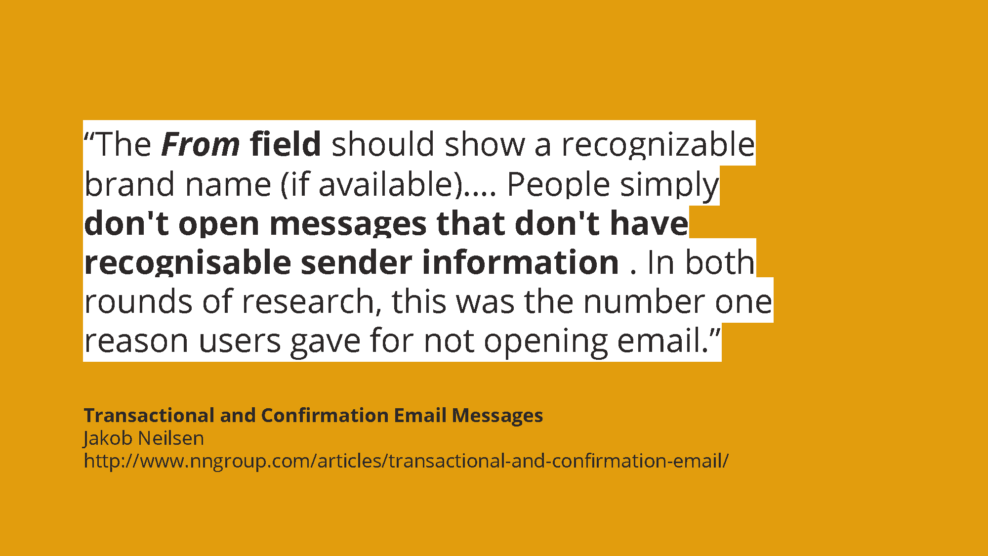
A particular bugbear is people not paying attention to the sender name. It can also mean that it can get caught in spam filters.
Slide 29
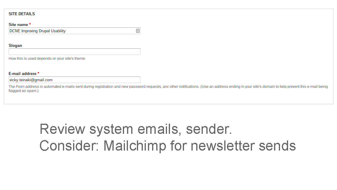
At the least I recommend making sure your system emails are checked when you set up the site (particularly the sender, as found in Admin > Administration). For more general sends, it’s worth looking at the Mailchimp module (and Mailchimp) for other newsletter sends that will also pass spam filter laws.
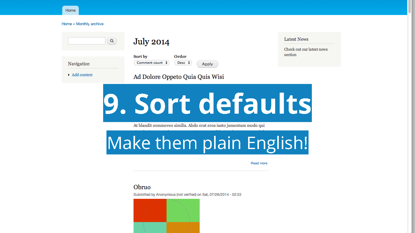
Slide 30
The rise of ecommerce has made sort and filter more important. (Oh, for site builders who don’t know about it already, devel_generate is a great quick way to test sites using dummy content). However, this has also made them more sophisticated.
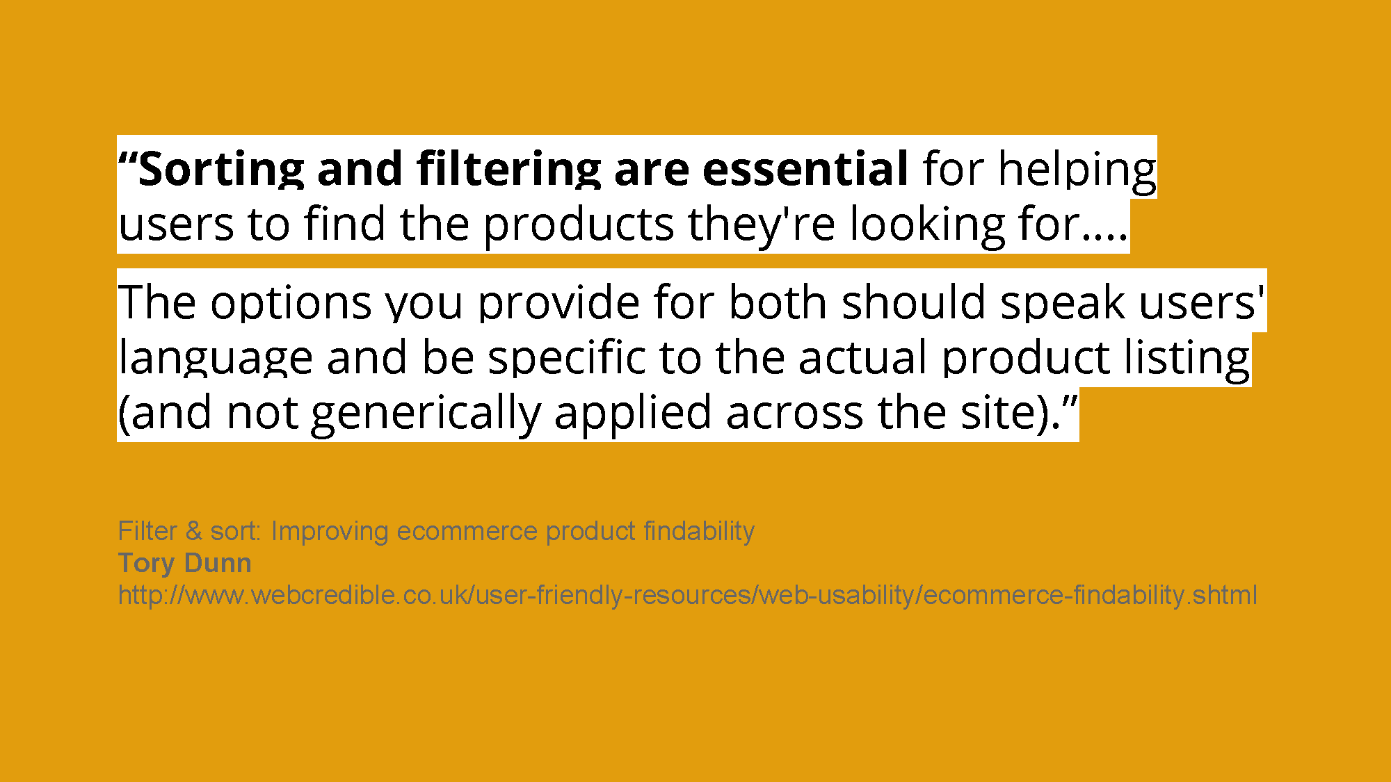
Slide 31
In this quote, the author notes that being specific in terms of the filter results will also help people find what they need to buy. Booking.com is a great example for customised results.
Slide 32
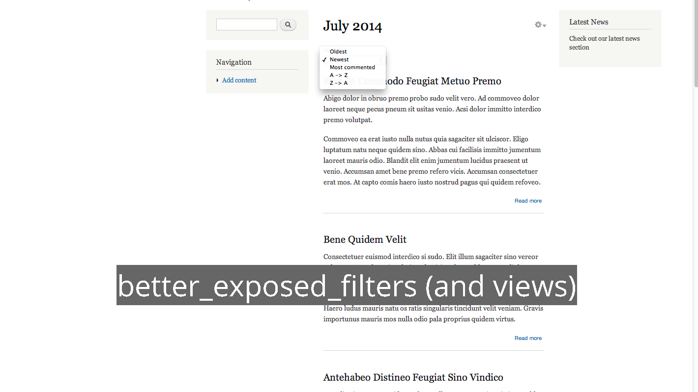
Better Exposed Filters is a great module for letting you customise (and remove extra) filters.
Slide 33
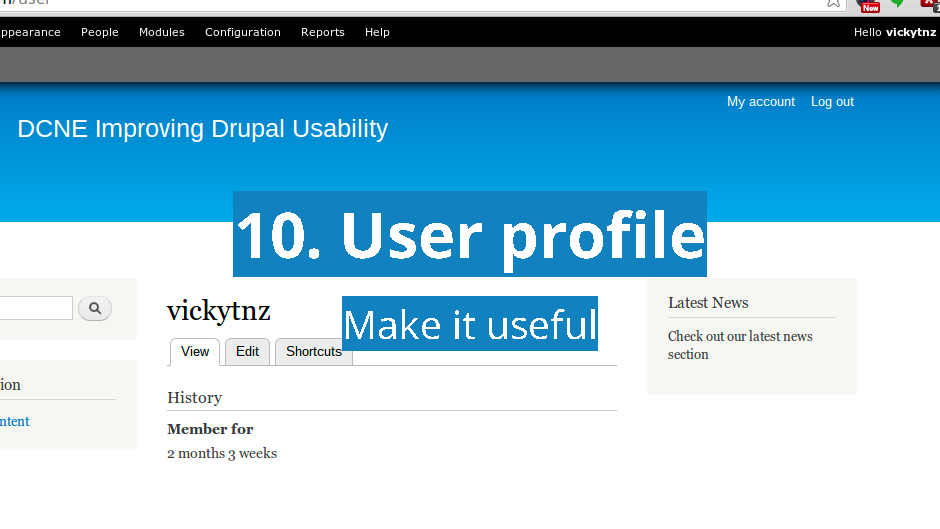
I’ve always hated the default user logged in page, as it’s not particularly useful for anyone.
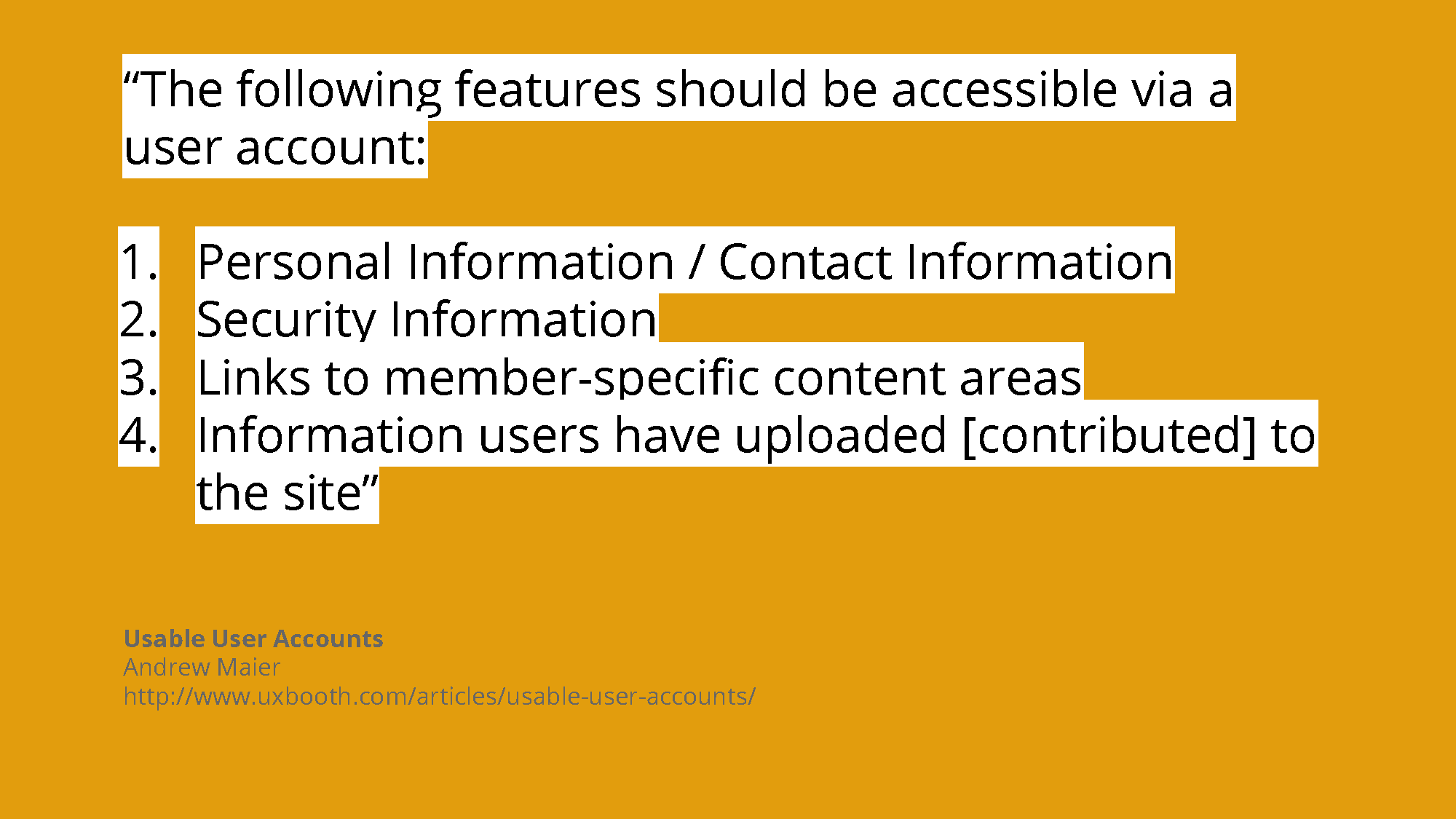
Slide 34
Andrew Maier of UX Booth makes a good summary of what to consider with user account pages.
Slide 35
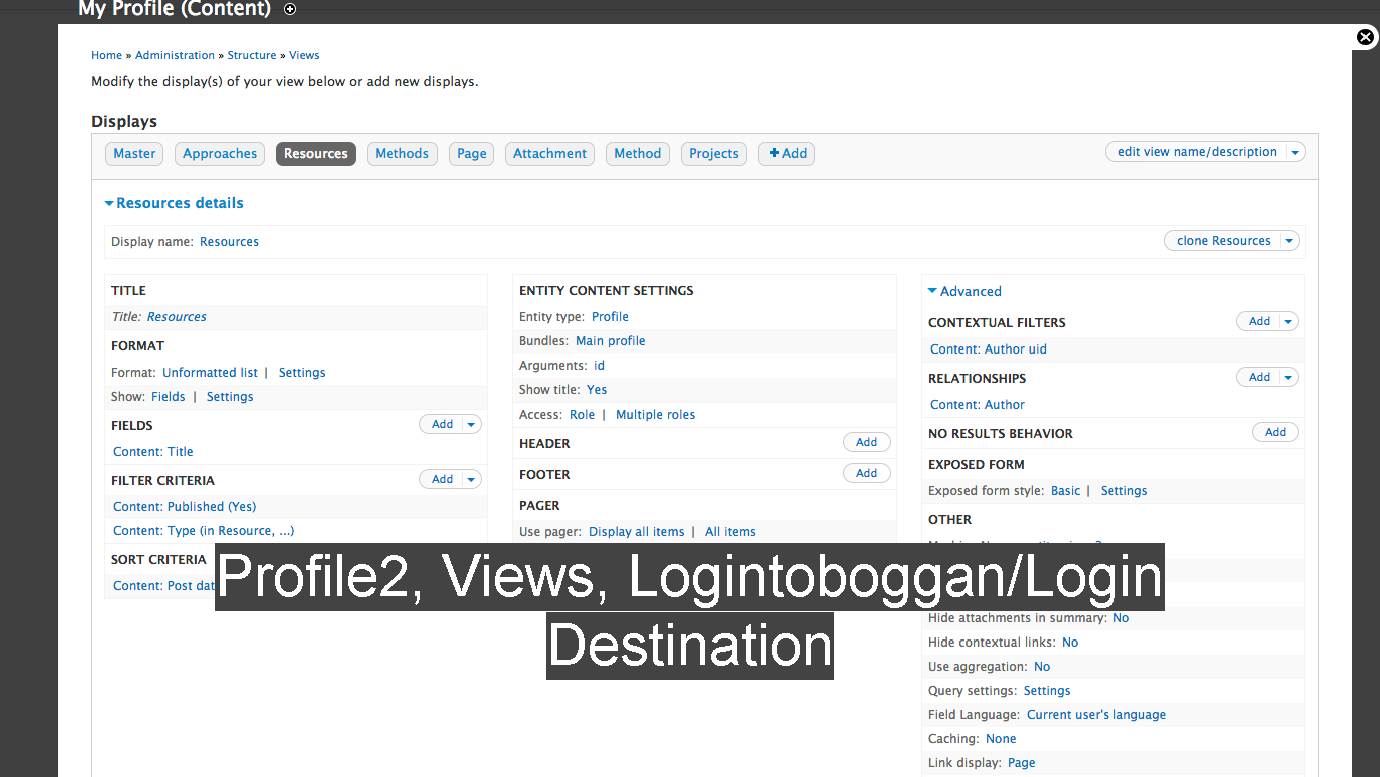
Logintoboggan lets you bypass this page on login. There are a number of modules to help you make the landing page more useful.

Slide 36
Beyond the 10, here are a few useful tips and modules to think about.
Slide 37
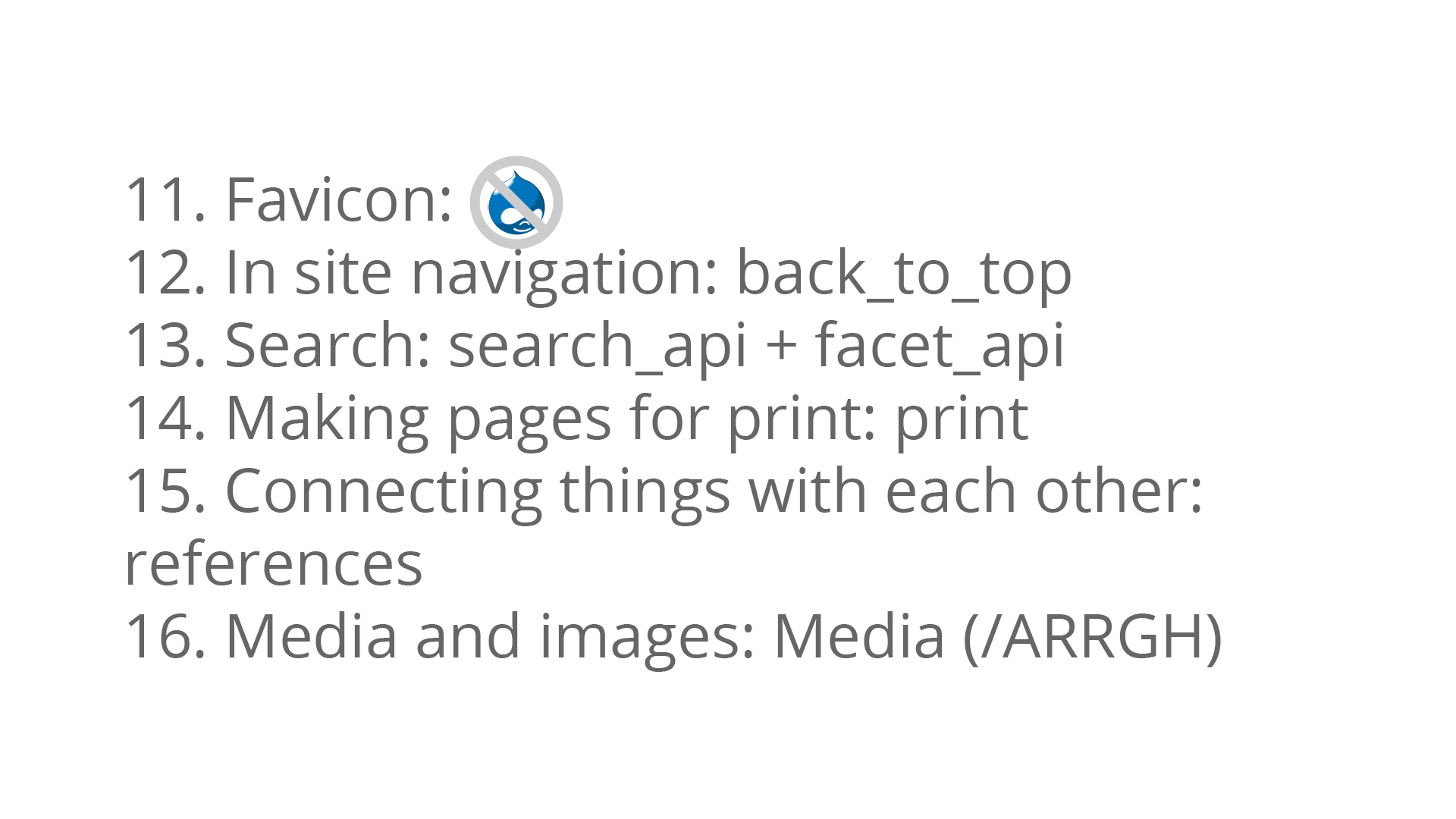
First of all: change your favicon! As much as I like the Druplicon, I shouldn’t see it on lots of sites.
As I mentioned in another part, Back To Top is a nice way to let people better navigate long pages.
For search, large sites that can justify the cost use Apache Solar (it needs Java and a lot of processing power). For smaller sites, look at Search API and Facet API.
I’ve worked on sites where printing is a key need (such as one for modular furniture). In this case, the print module lets you completely customise the print view.
For connecting things with each other there are a lot of modules such as references.
I still haven’t found a good way with dealing with images: media is good in some ways but accessibilty isn’t one of them. Here’s waiting for Drupal 8.

Slide 38
Any questions?
Member discussion